
brambles glass
Brand, identity and website design
DELIVERABLES
LOGO DESIGN
BRAND IDENTITY
BRAND COPY
COLOUR PALETTE
TYPOGRAPHY SYSTEM
website design
CONTENT TEMPLATES
Bethan Clarke makes stained glass rooted in botanical forms. The brand needed to feel as warm, natural and human as the work itself.
BRAND PURPOSE
THE CHALLENGE
Stained glass is a centuries-old craft, and it can easily feel distant from contemporary interiors. The challenge was to honour that heritage without letting it look dated.
Sister Studio created an identity that felt rooted in tradition and still right on a modern shelf, a modern website and a modern feed.
lOGO DESIGN
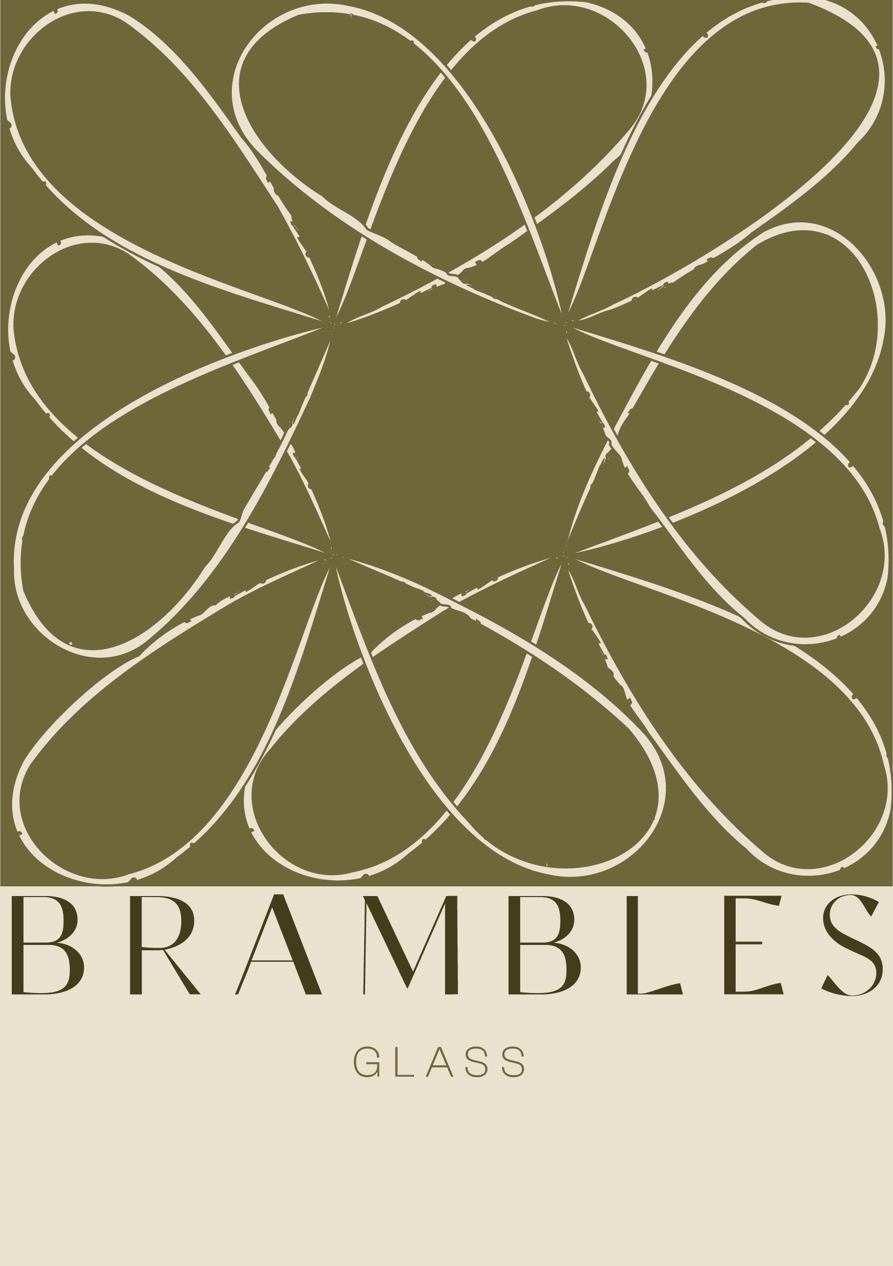
Built from one of Bethan’s glass leaf pieces, the mark is repeated into a tangle of bramble stems. Each stem loops into the next, so the logo reads as growth rather than a static symbol.
Sister Studio developed the a full system, with versions for every size and use, so Brambles Glass stays recognisable from a label to a website header.
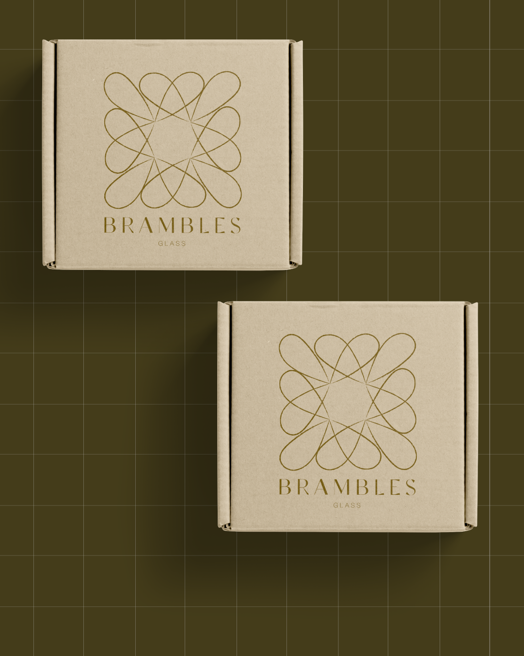
Packaging
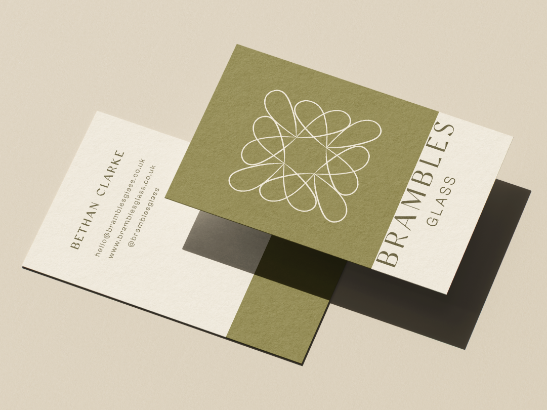
Business card design
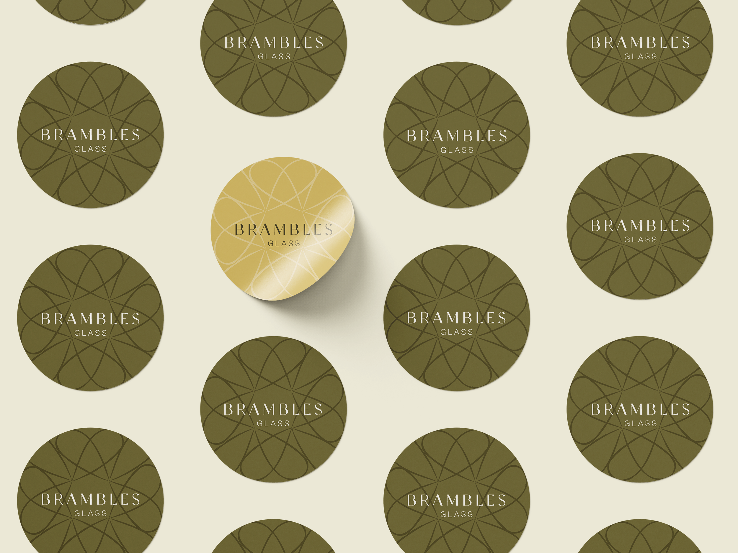
Stickers
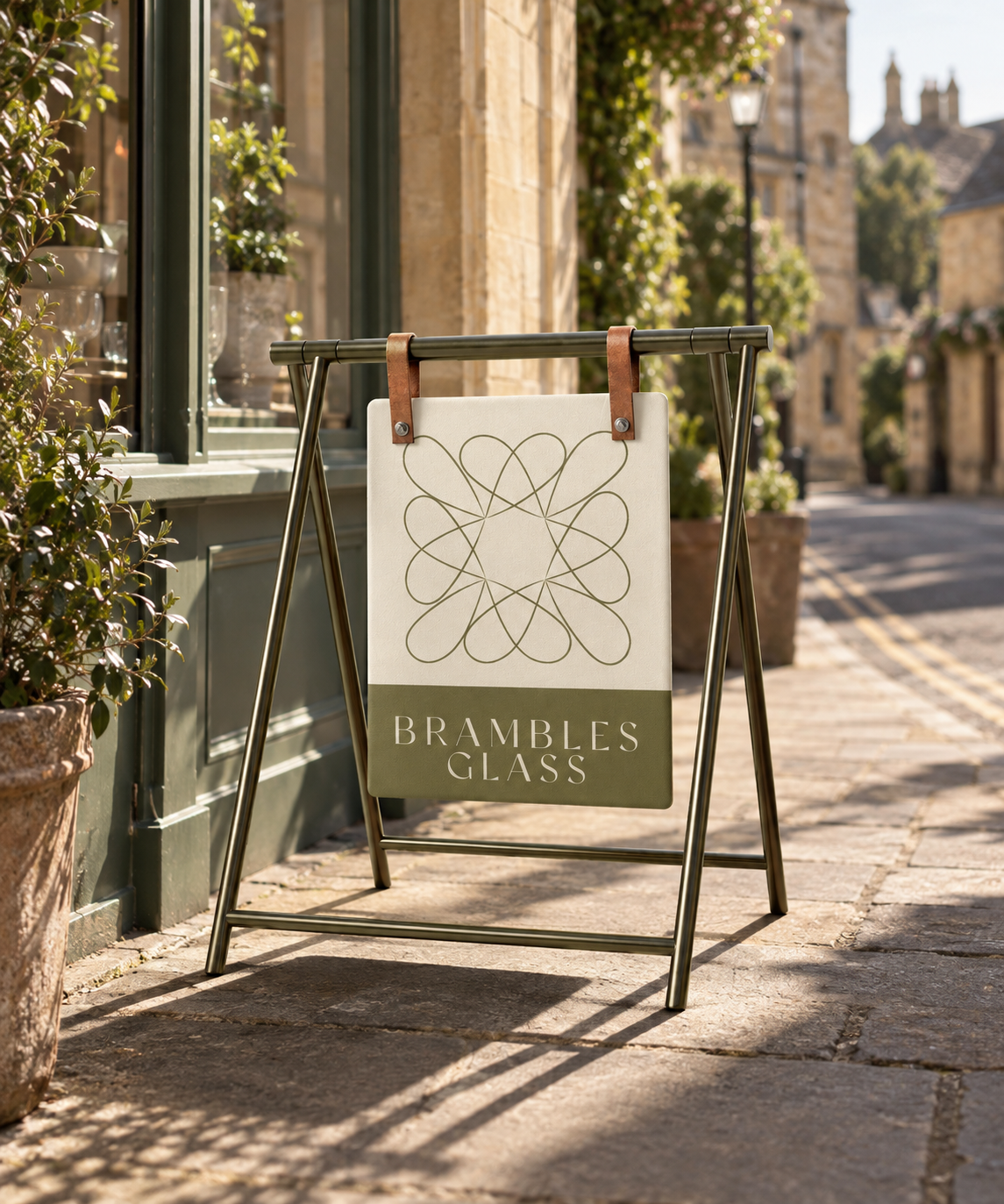
Signage
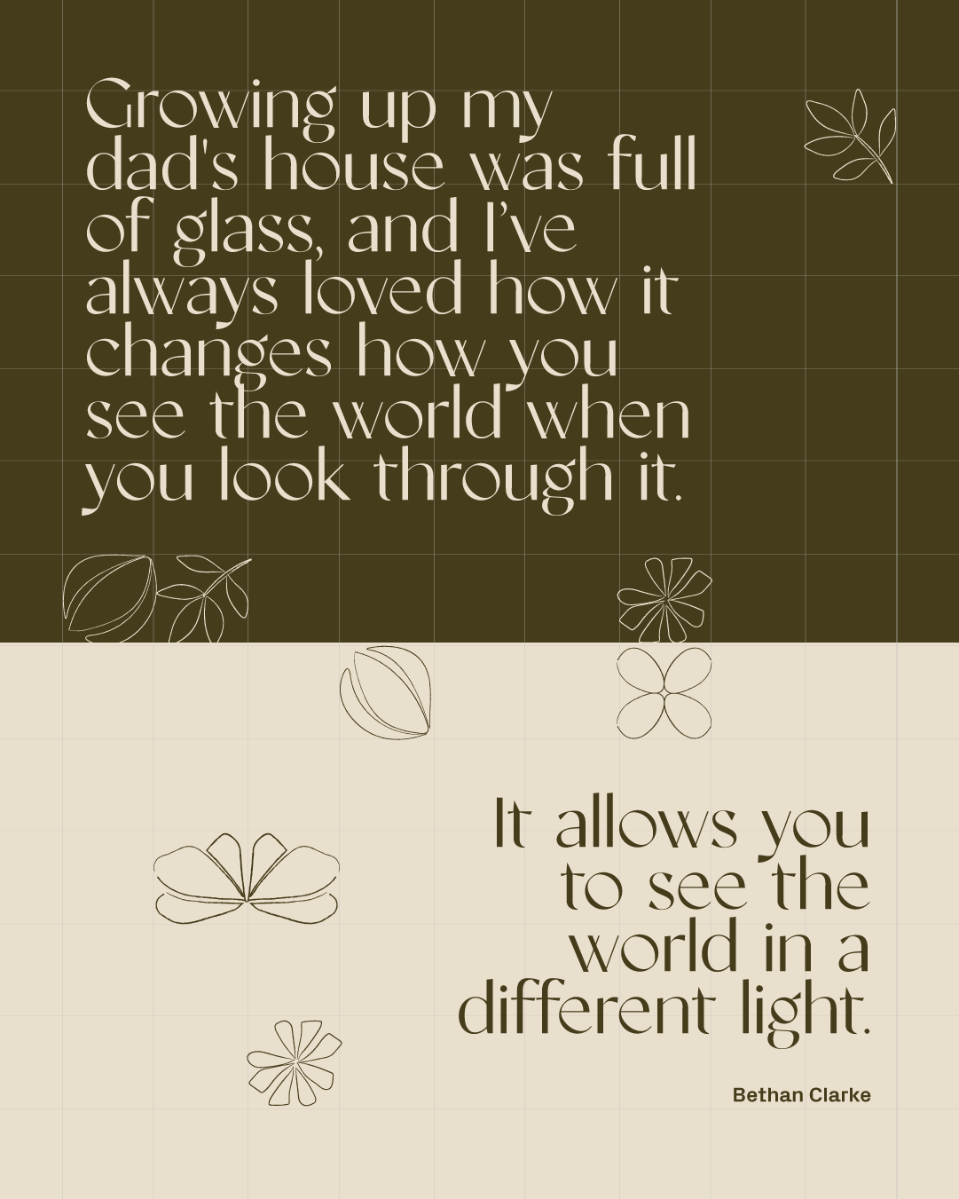
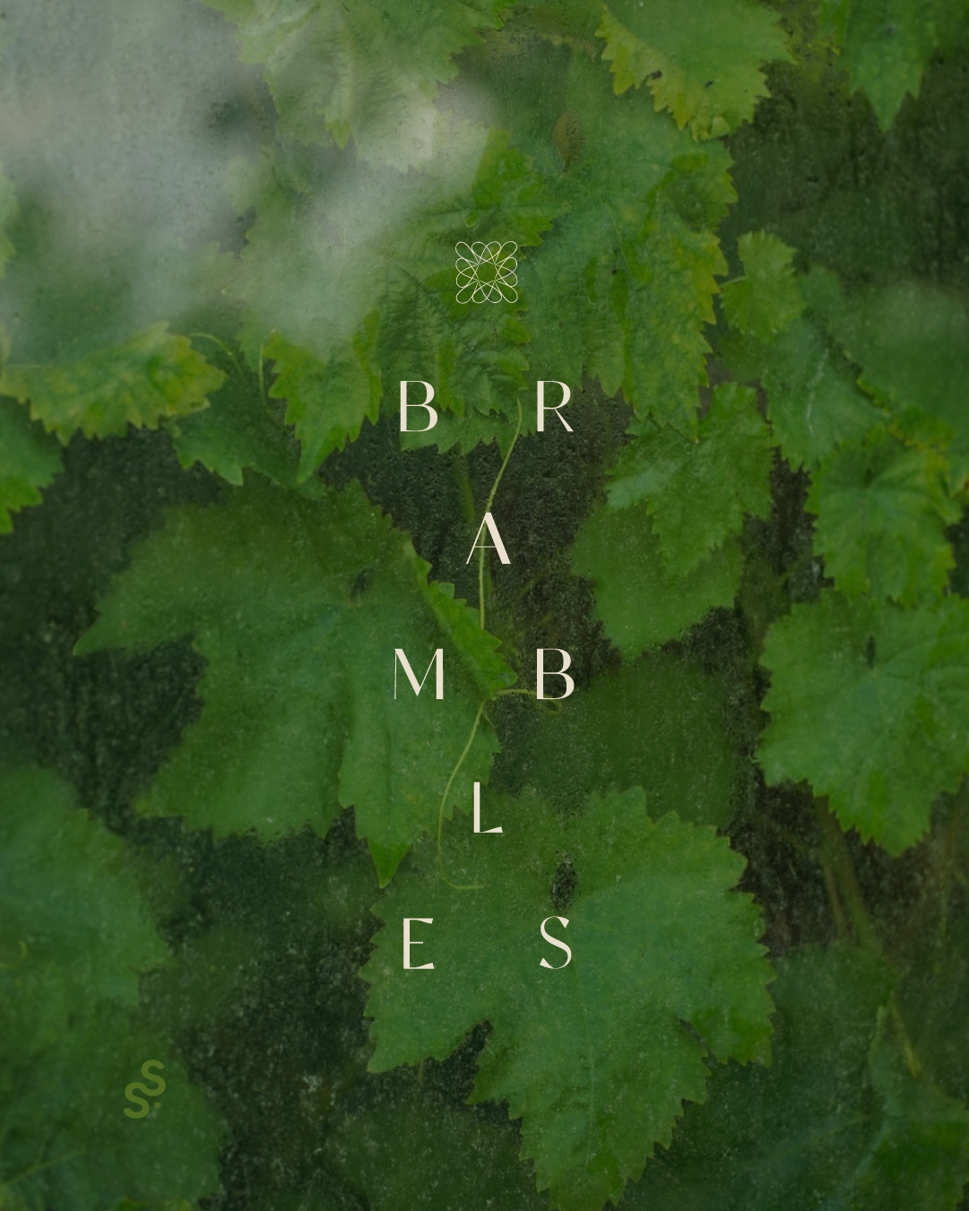
Impactful Social assets
Typography, Layout
and Icon Design
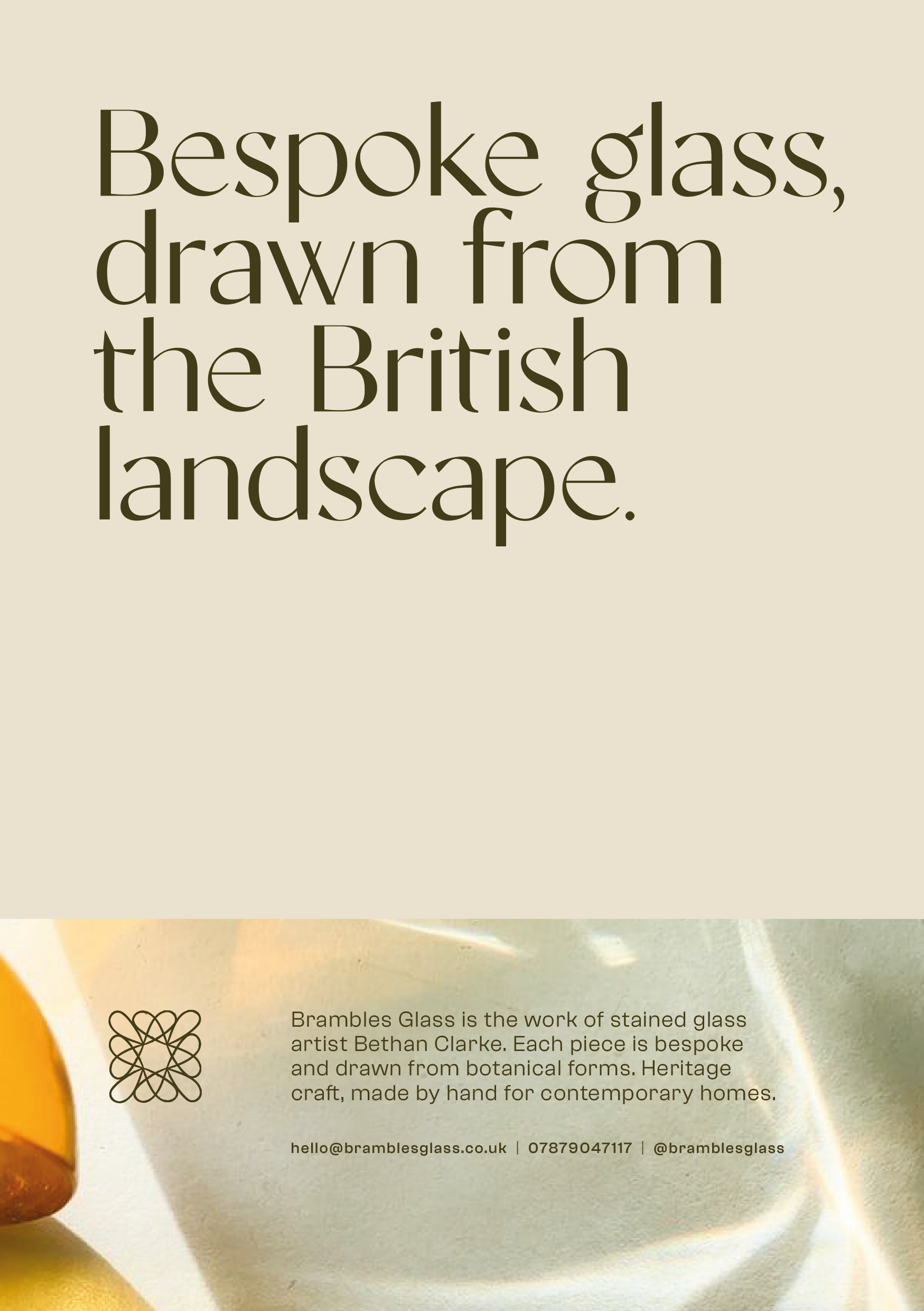
Stationary design
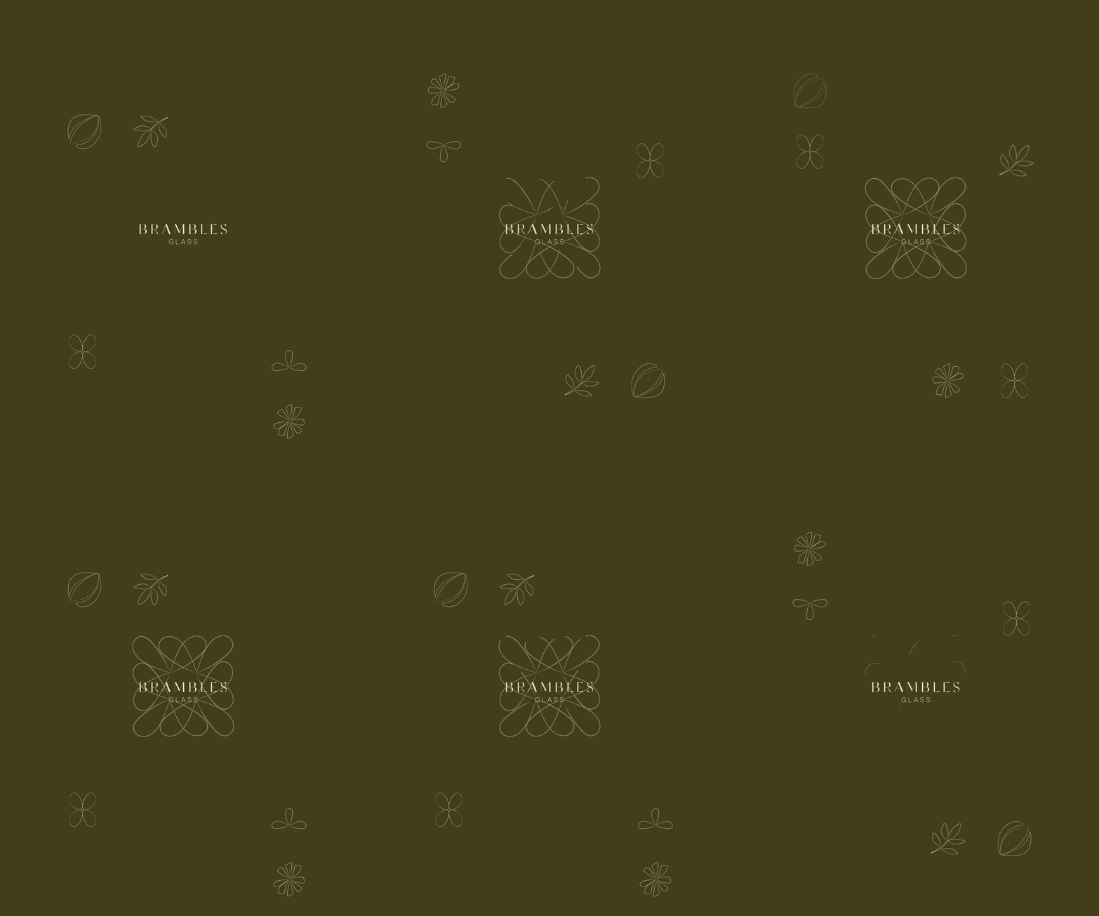
ICONS
The icons are taken directly from Bethan’s glass pieces, so they carry the same botanical detail as the work itself.
Simple with a hand-drawn quality to communicate the hand crafted nature of Bethan’s work.
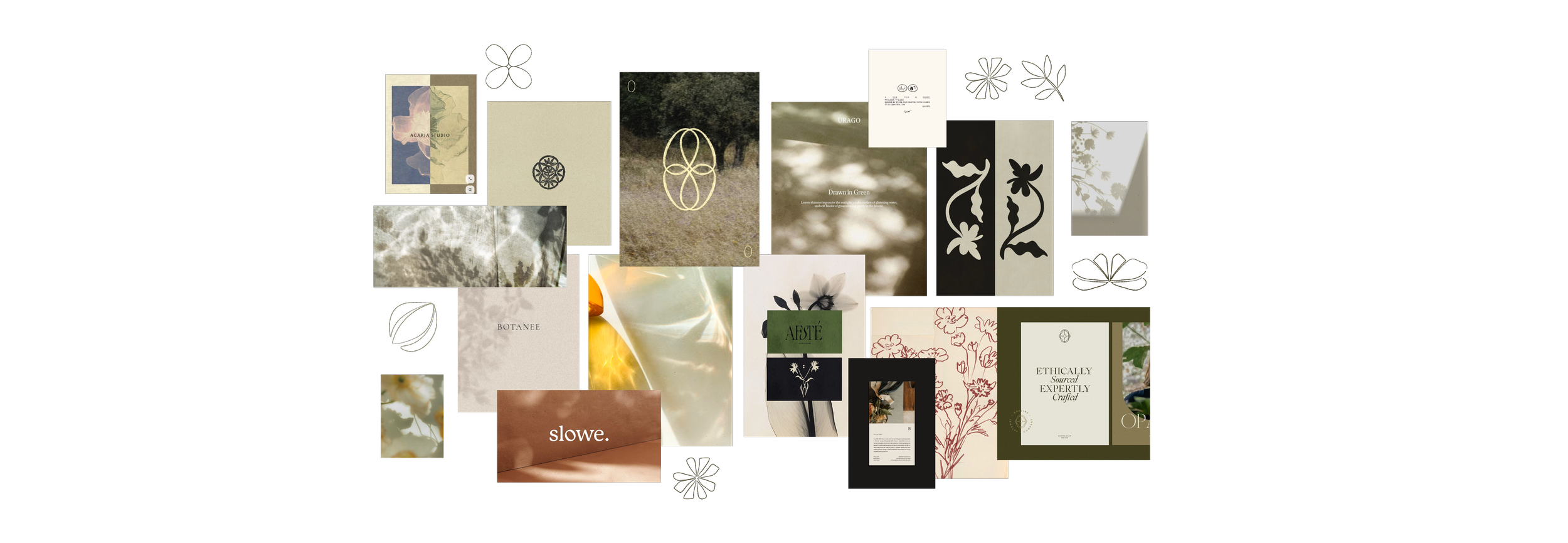
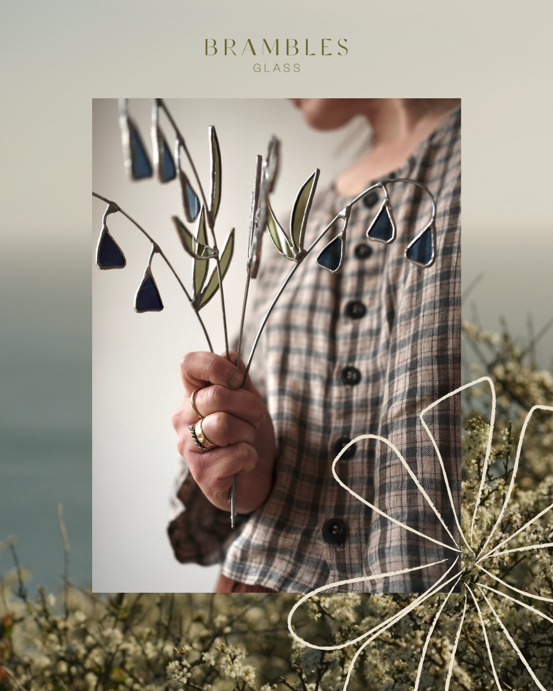
PHOTOGRAPHY DIRECTION
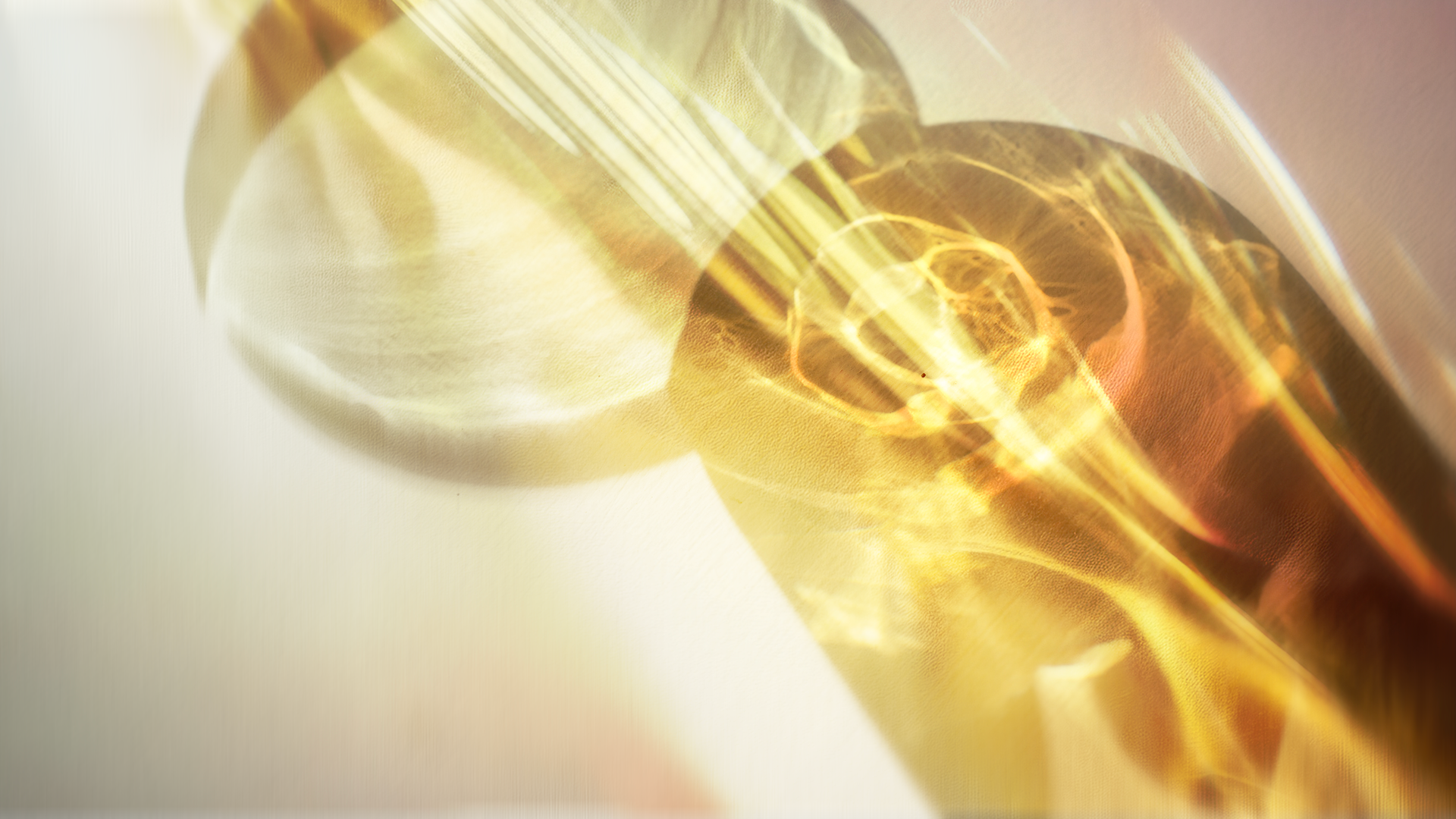
With glass, light and shadow are the focus.
We celebrate this by pairing the branding with shadows and silhouettes of botanical forms cast across stone, ceramic and glass surfaces, soft and transient against the precision of leaded glass.
Bethan’s work makes natural forms permanent; the photography catches them at their most fleeting.
The layering effect mirrors how stained glass is actually experienced, light broken up and reassembled through material. The viewer is seeing the same thing twice without realising it.
Surfaces are kept cool and neutral throughout. With the only colour shining through the glass itself.

SOCIAL CONTENT TEMPLATES
A logo is one line in a much longer conversation. A brand speaks through its colour palette, its typography, its layouts and the way it sounds across every post, story and carousel it publishes.
Sister Studio designs that whole language, including the social content templates that come with every identity. Social is where most people meet a brand day to day, so the templates are built to make every post look like it belongs to the same business without starting from scratch each time.
Every template is drawn directly from the identity, so the mark, the wordmark and the palette are used as designed. Templates are built in editable software, so the business can change text, swap images and produce new posts in-house without needing to come back for every update.
The result is a brand that can keep talking fluently long after the launch is over.
WEB DESIGN
The site is designed to feel like the work it sells. Its palette of sage, linen, warm gold and dark olive, taken from the glass itself, runs through every page, so each product sits against a background that feels considered rather than generic.
Layouts are kept clean and uncluttered, letting the pieces lead and the commission and shop details stay easy to find. Every page feels like a natural extension of the studio: calm, bright and welcoming.
TESTIMONIAL
“Working with Lissy was a collaborative and creative process. She has an excellent eye and a strong instinct for visual identity, and she really listens to what you’re trying to achieve. She took the time to understand my brand and translated that into something thoughtful, distinctive, and considered.
I’m really proud of where we landed, she has real talent.
Bethan Clarke, Founder
Other projects

the old bakery
branding and identity design
sleepydoe pyjamas
social ad campaign
hue + holasz
identity design, content creation and website