
The OLD BAKERY
Brand and identity design
DELIVERABLES
LOGO DESIGN
COLOUR PALETTE
FONT PAIRING
ICON SYSTEM
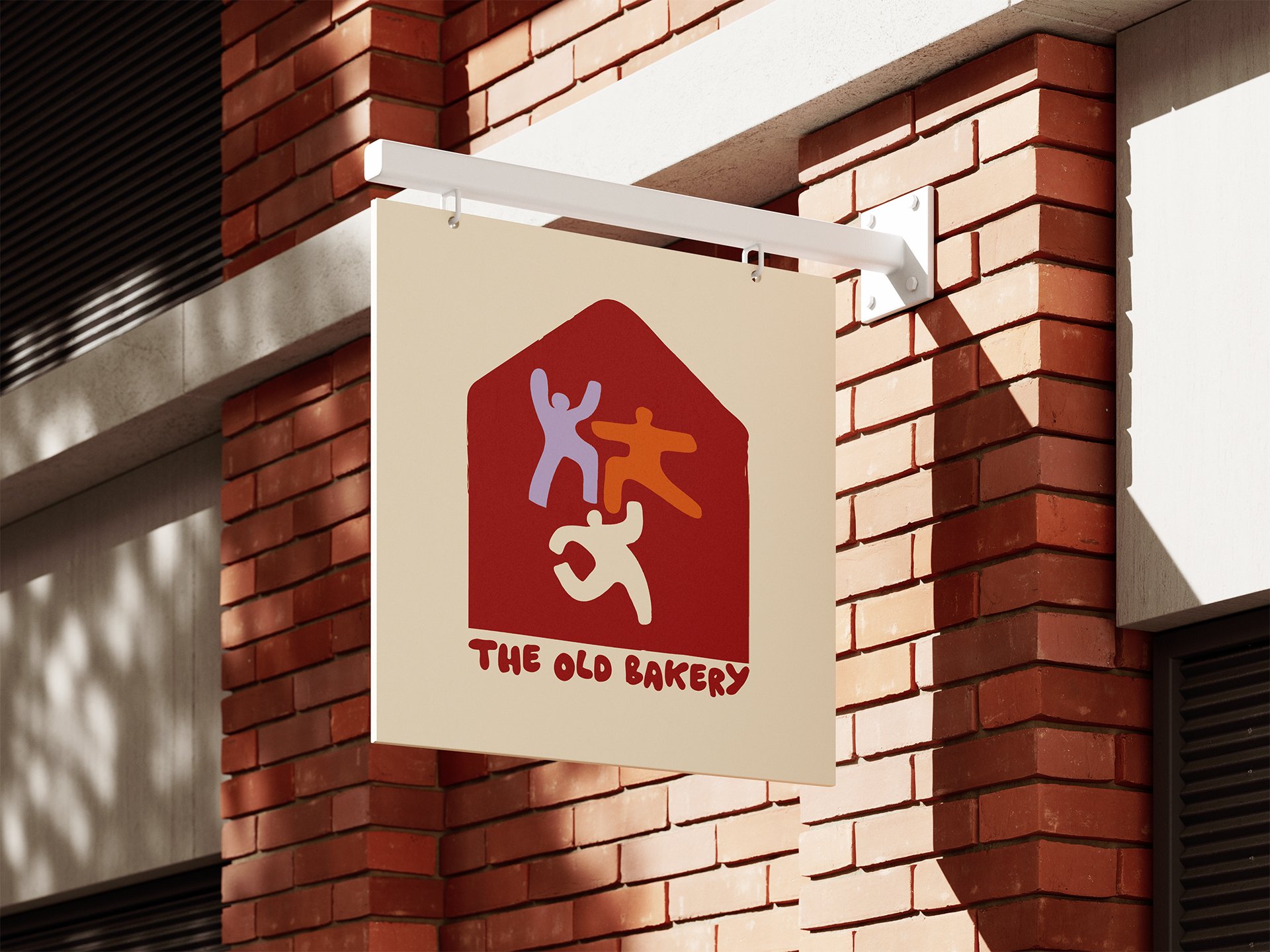
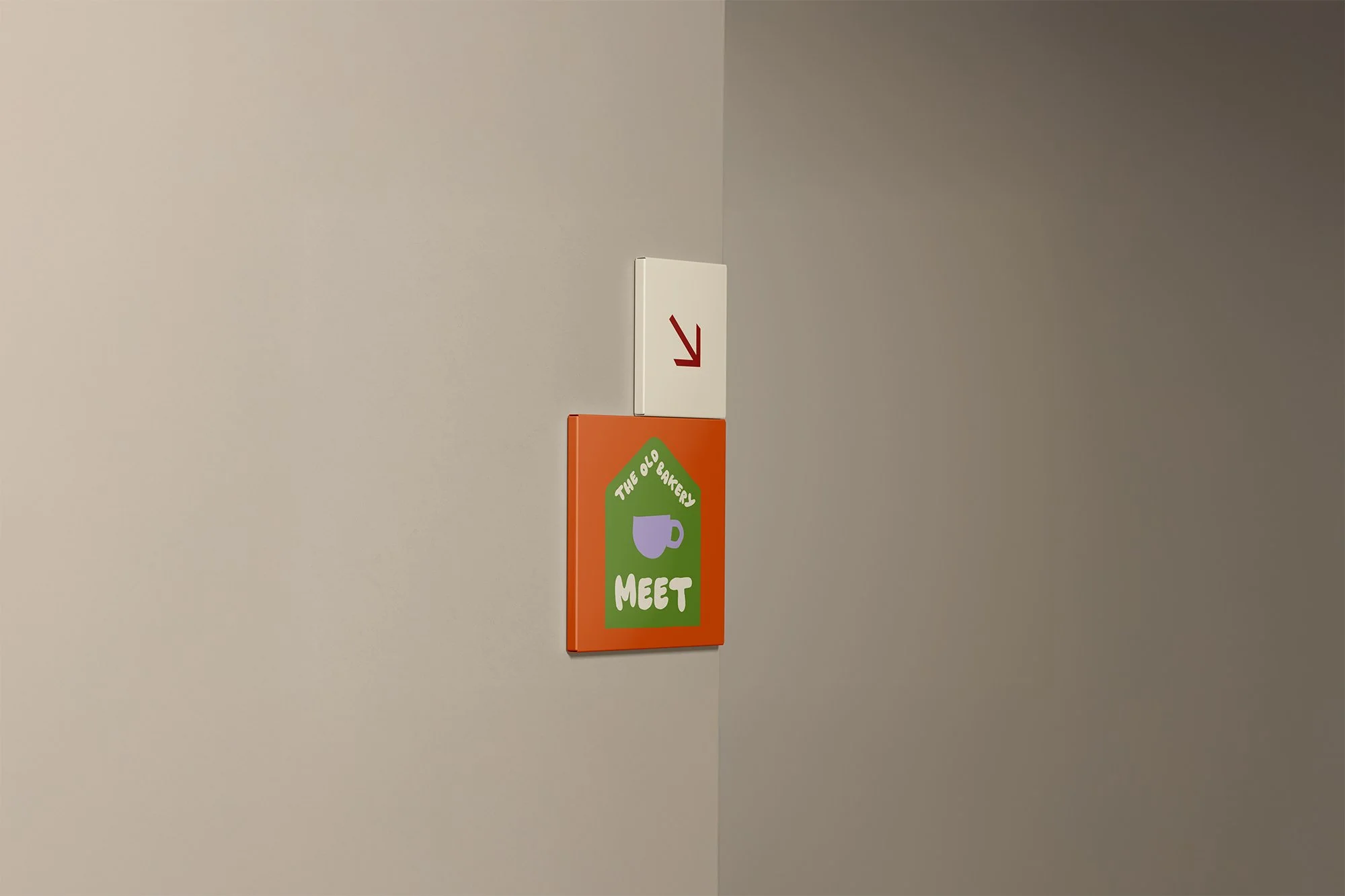
SIGNAGE
To bring movement, work and creativity together under one roof, without losing what makes each part special.
The Old Bakery is a new not-for-profit space opening in Newhaven: a movement studio upstairs, co-working and a café downstairs, with local artists' work rotating through the rooms. Once an old bakery, later a joinery workshop, now reopening as somewhere to move, work and gather.
BRAND PURPOSE
Celebrate the character of a working town while giving the space a warm, hand-made identity that feels vibrant and unmistakably its own, not another beige wellbeing brand.
Sister Studio worked with founder Rori to create a brand kit, alongside an icon system and internal signage for the space.
THE CHALLENGE

lOGO DESIGN
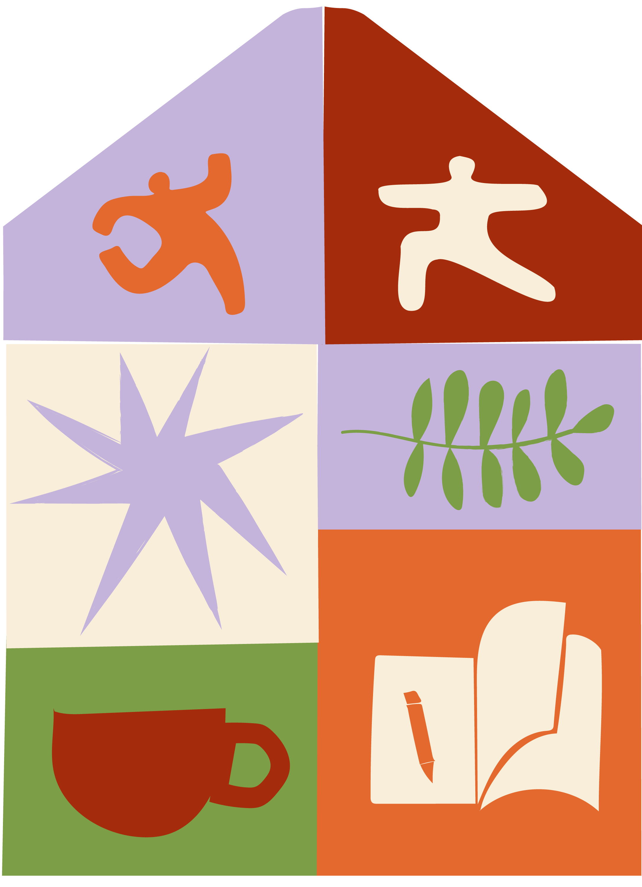
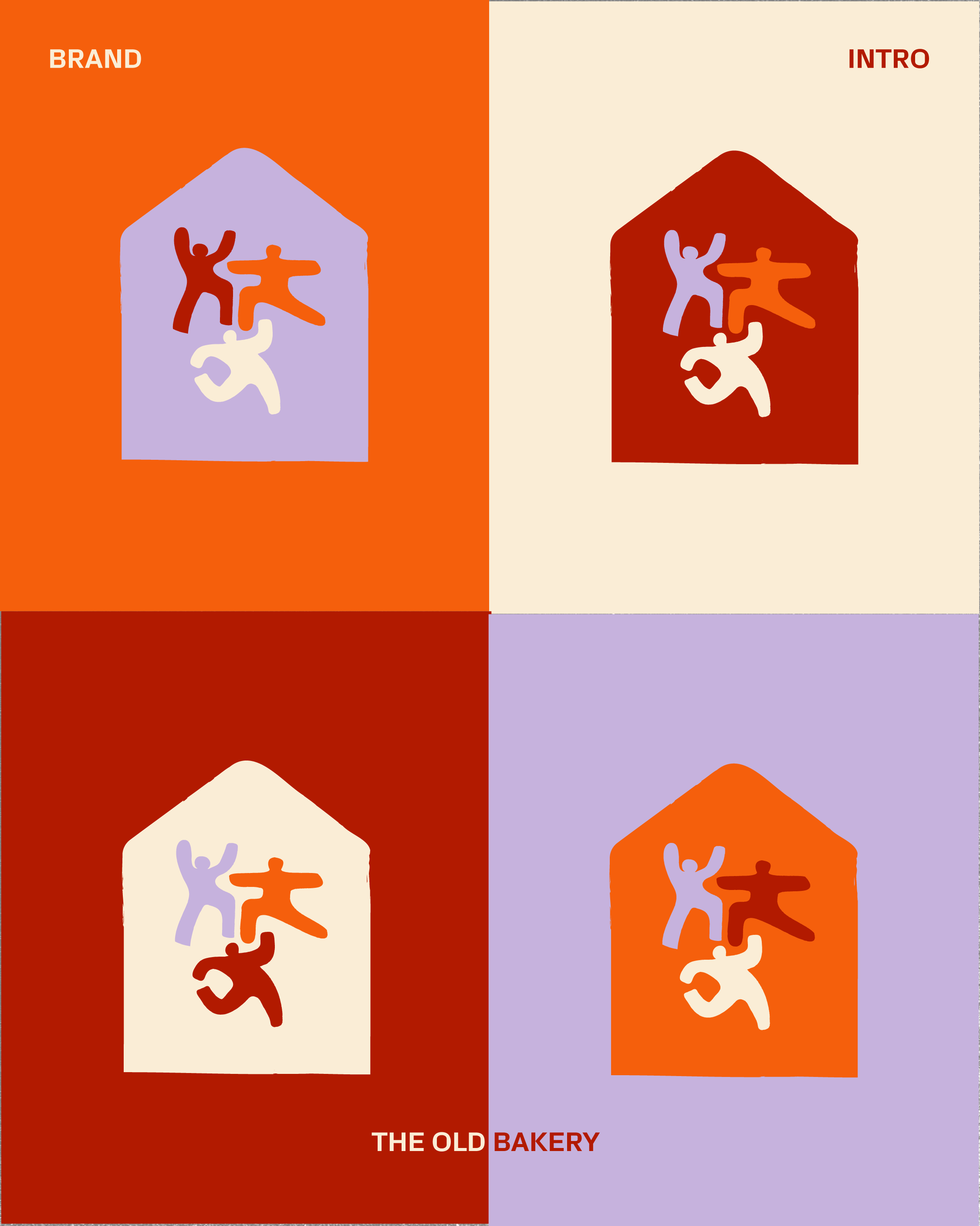
A hand-lettered wordmark paired with a building mark: the bakery's own pointed roofline, holding three dancing figures who stand in for the people who'll actually use the space.
Built as a full logo system, full mark, brand mark, wordmark, badge and signage mark, so there's always the right version for the right moment.
THE GABLE
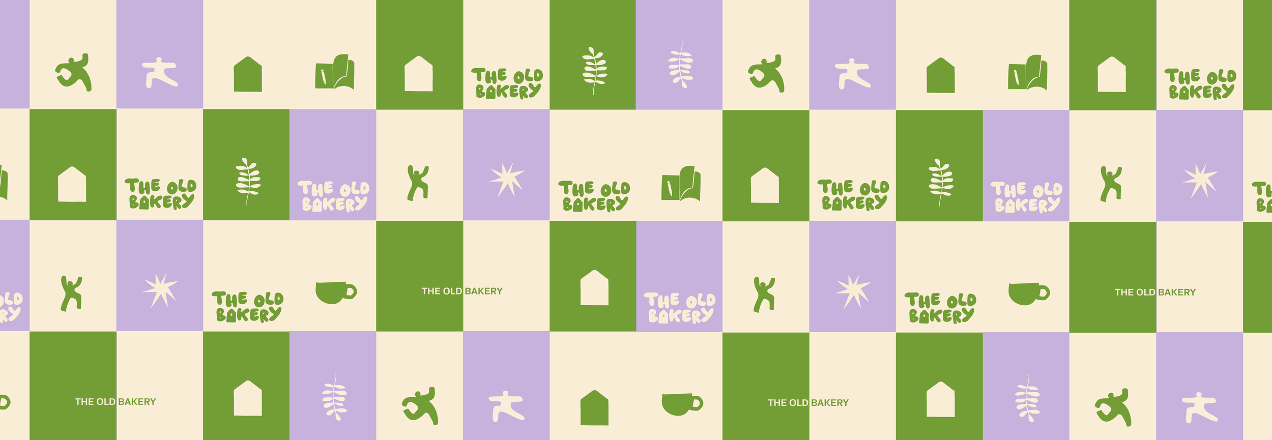
That same roofline, the gable, is the shape the whole identity hangs off. It takes on a different icon and colour for each part of the building, Move, Work and Meet, so each space reads as its own while still sitting under one roof.
It gives the brand a system that can grow room by room, new areas, new signage, new social tiles, without ever looking like it's drifted off brand.
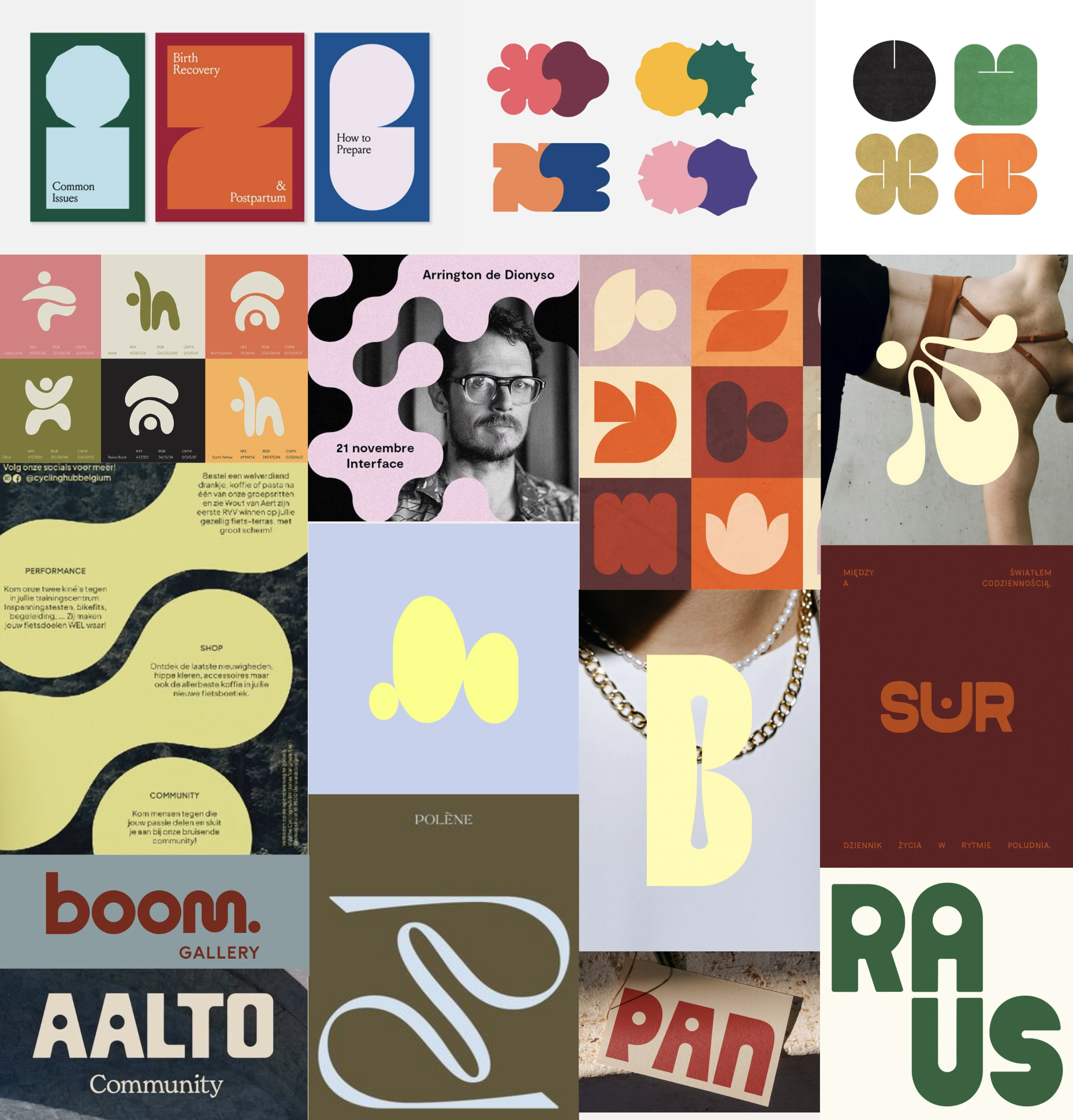
Moodboard:
fun, bold, hand made, community focussed
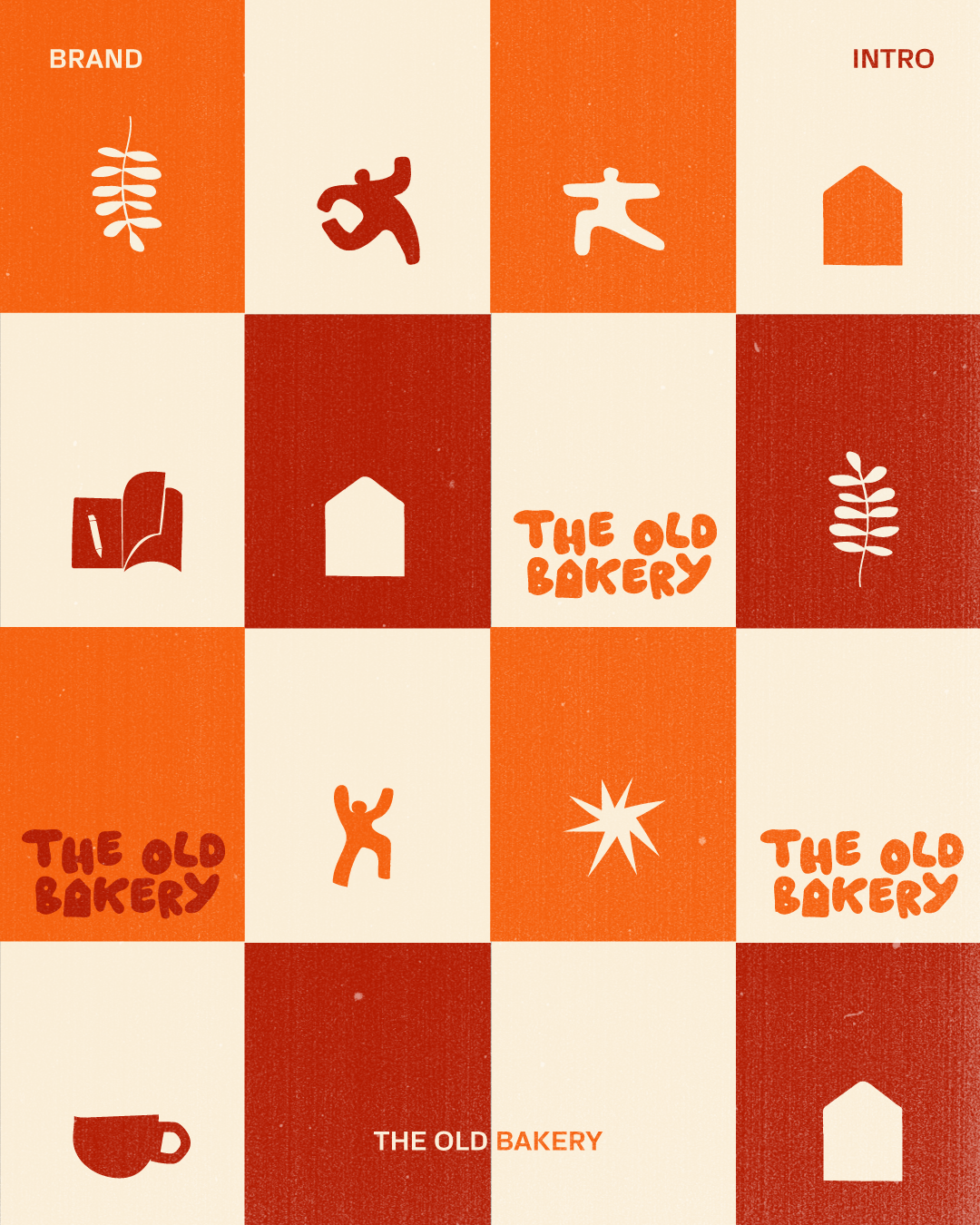
Colours and icons
Impactful Social assets
Energetic Brand colours
ICONS
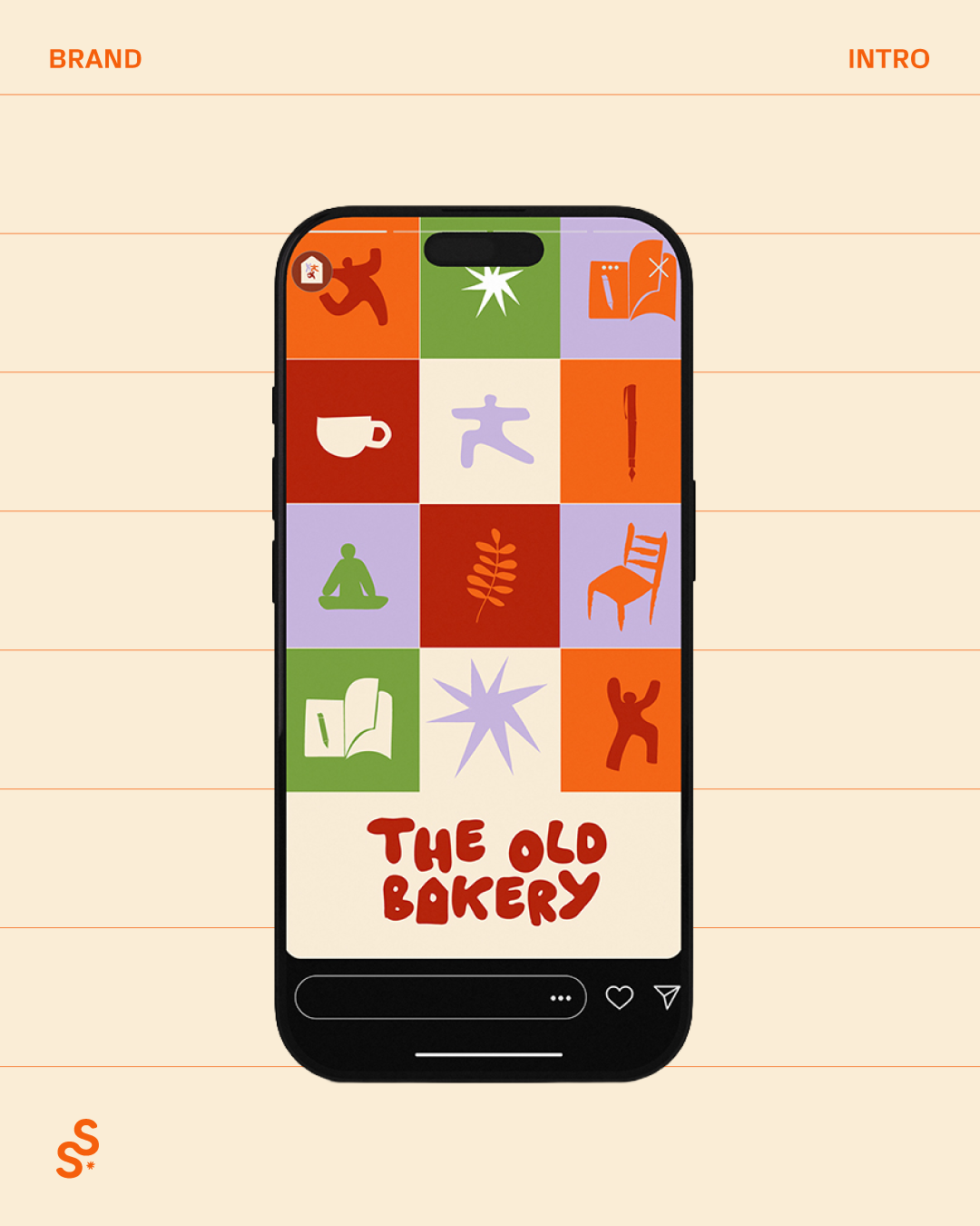
Beyond the main mark sits a wider icon set, one for each part of the building: a warrior pose for Move,
a chair for Work, a cup for Meet, alongside a handful of everyday shapes.
Each one is drawn loose and hand-cut, the same style as the three figures in the mark for a ‘human’ touch.
They can be used everywhere: internal signage, checkerboard grids across the palette, Instagram story sets, swapped in and out depending on the content.
COLOURS
A warm terracotta, inspired by the bricks of the building, paired with soothing heather lilac and fern green for wellness and calm.
That same energy runs into clementine orange, standing in for the vibrant, welcoming pulse of the community itself.
Cotton holds it all together as the base everything sits on, with charcoal and snow doing the quiet, practical jobs black and white would normally do.
Used in confident blocks rather than thin lines, so wherever it shows up, on signage, icons or the feed, it still reads as one brand.
TESTIMONIAL
“Working with Lissy was a collaborative and creative process. She has an excellent eye and a strong instinct for visual identity, and she really listens to what you’re trying to achieve. She took the time to understand my brand and translated that into something thoughtful, distinctive, and considered.
I’m really proud of where we landed, she has real talent.
Rori Cross Brown, Founder
Other projects
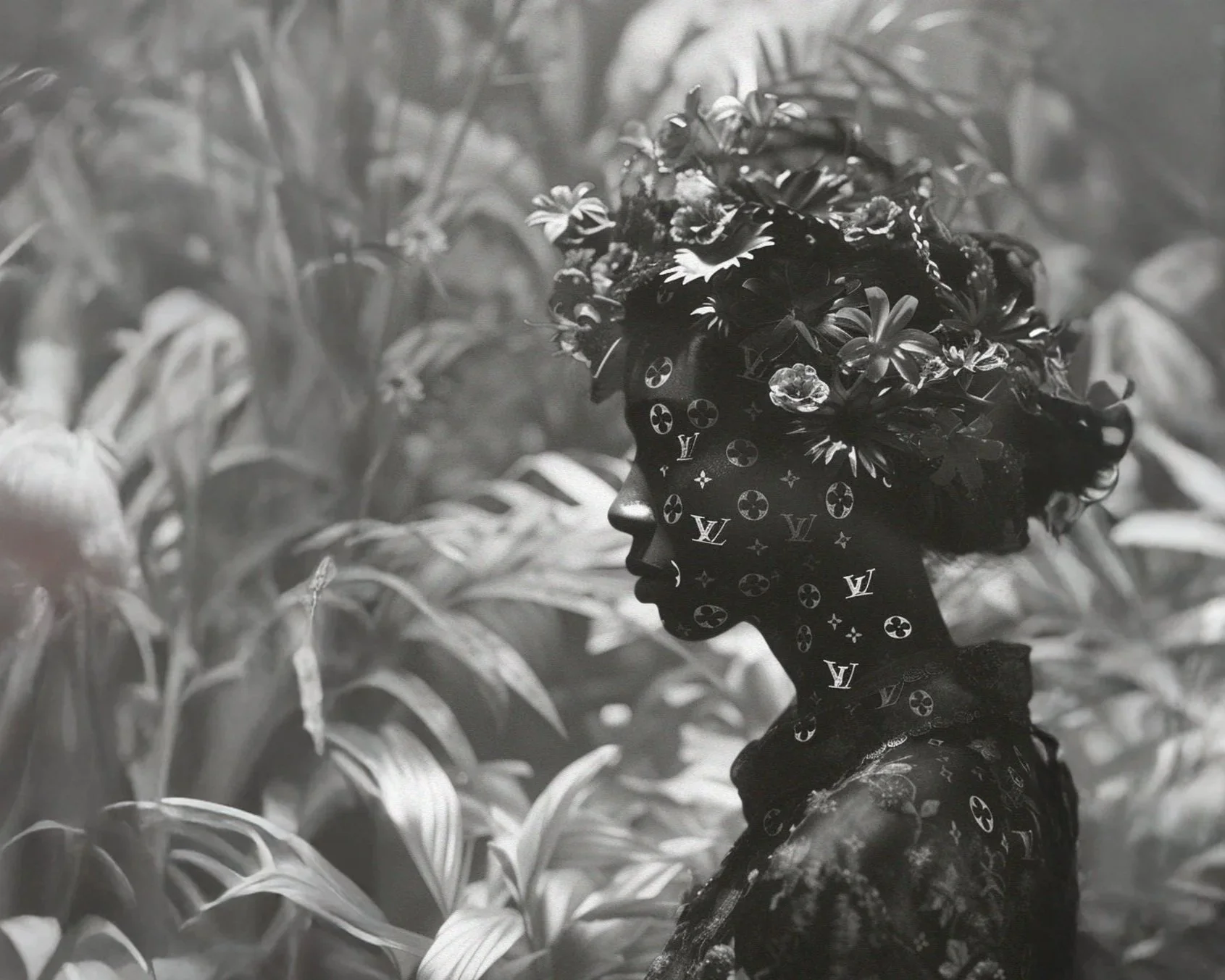
louis vuitton
deck design
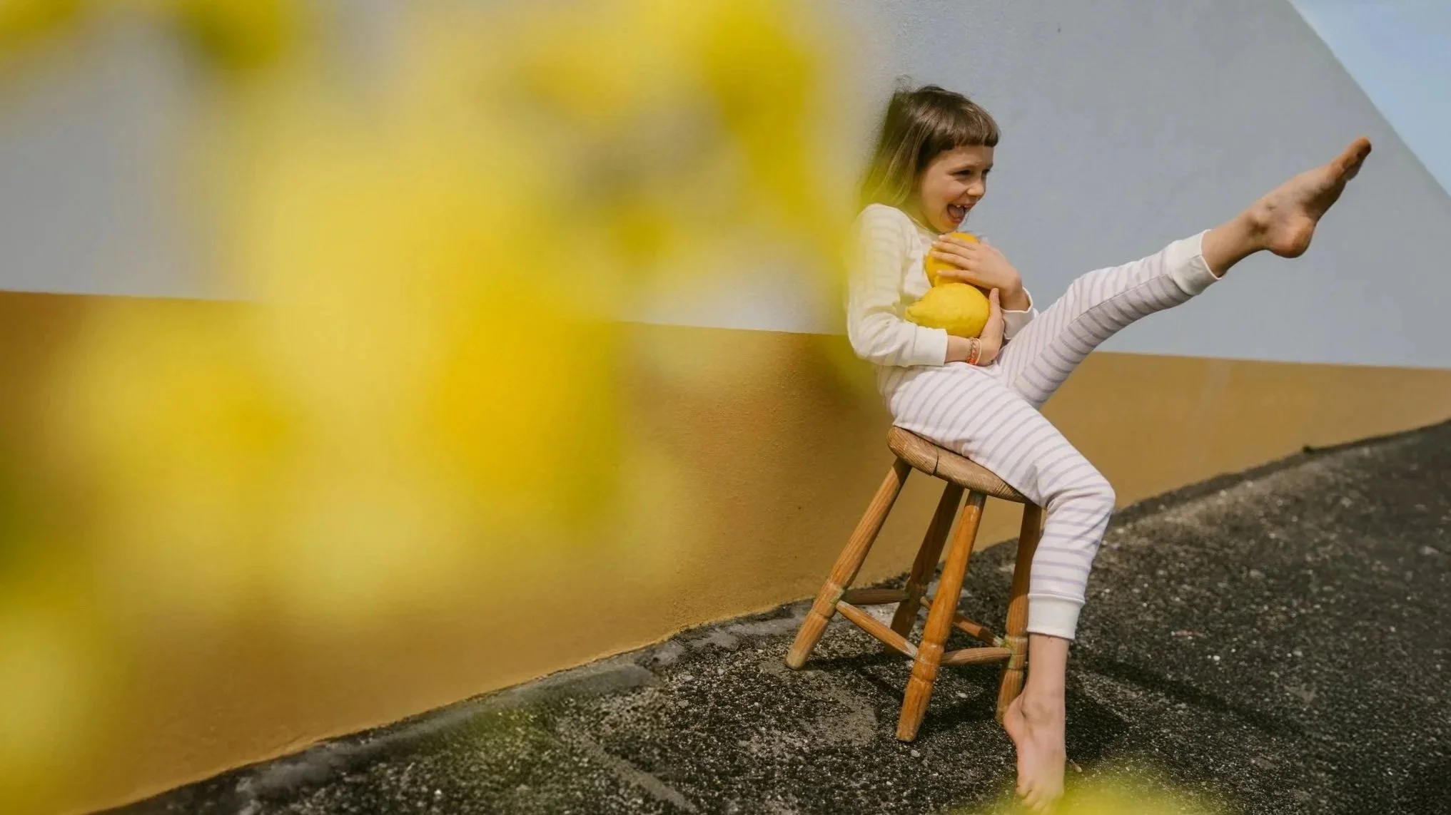
sleepydoe pyjamas
social ad campaign
hue + holasz
identity design, content creation and website