
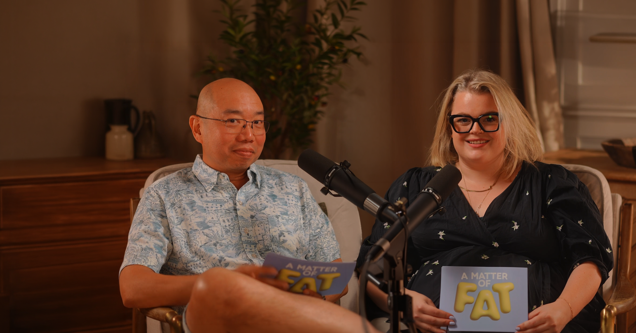
a matter of fat
Podcast identity design and platform artwork
Podcast identity
platform artwork
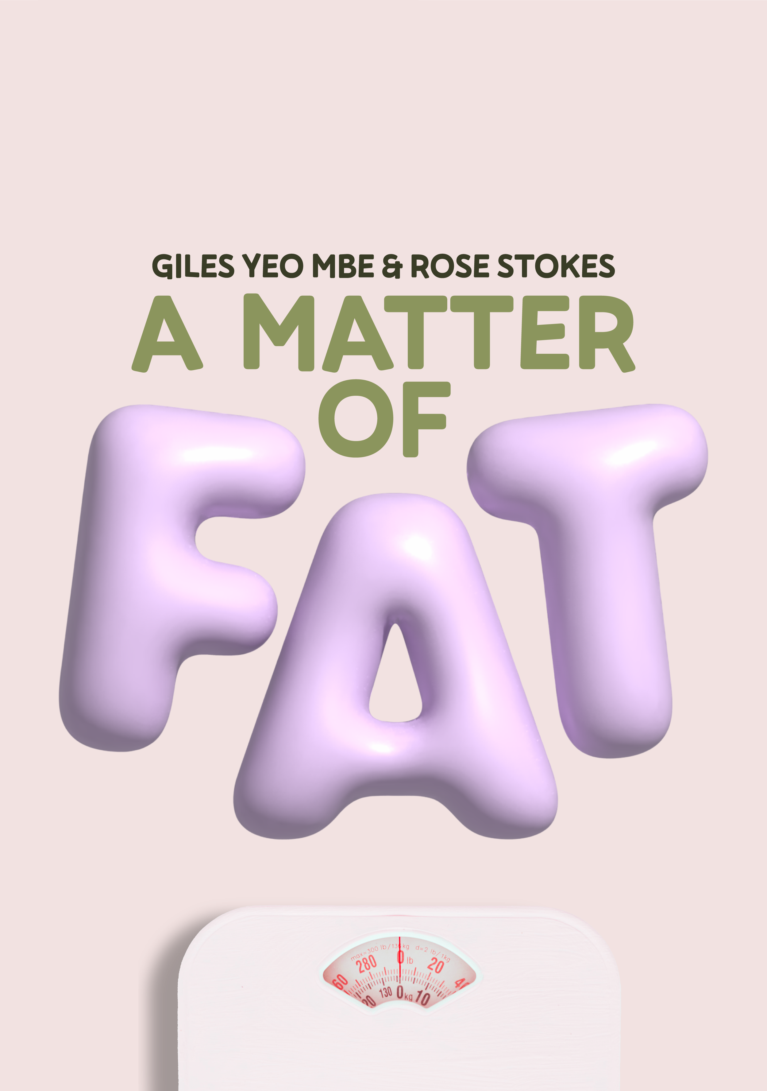
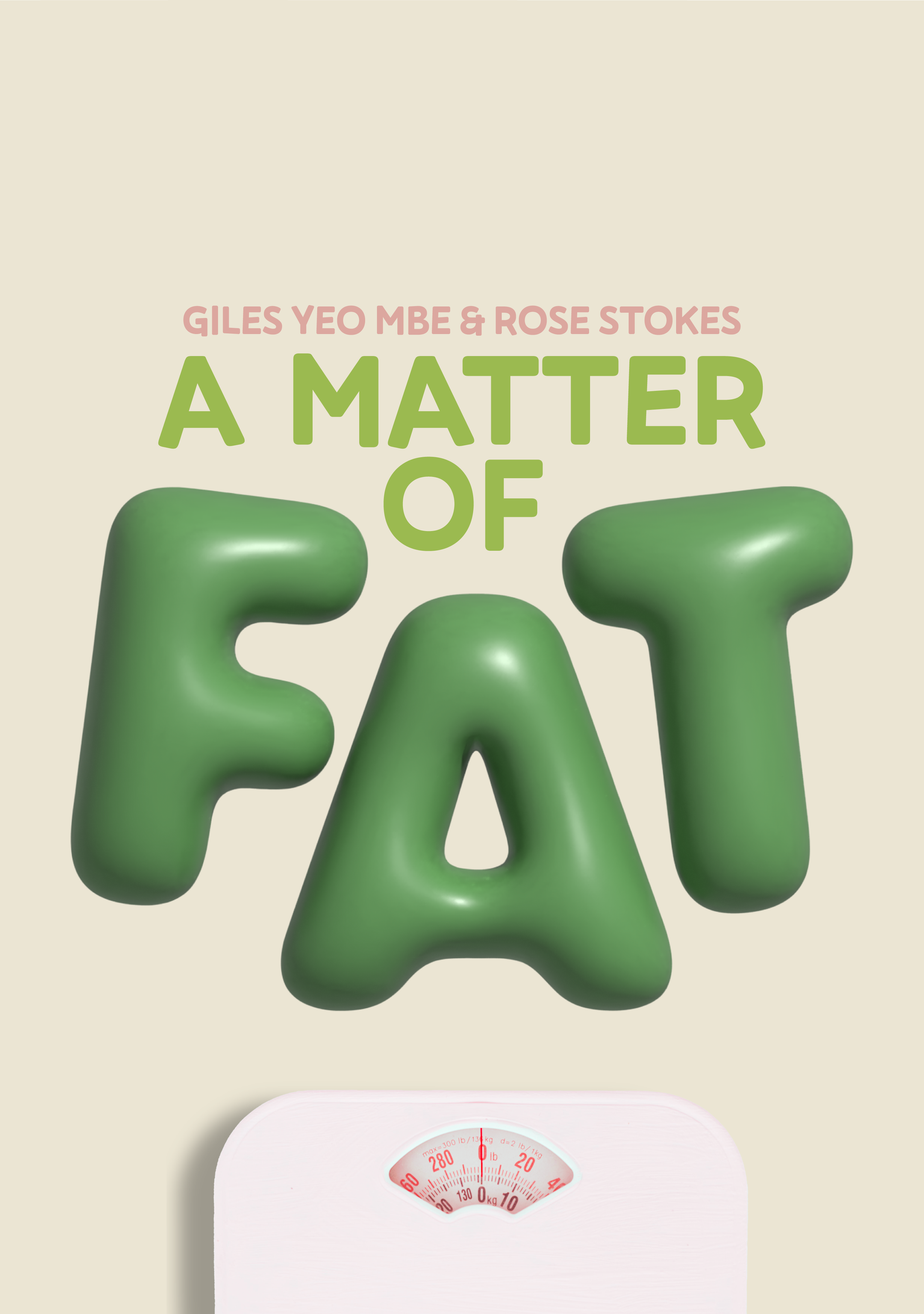
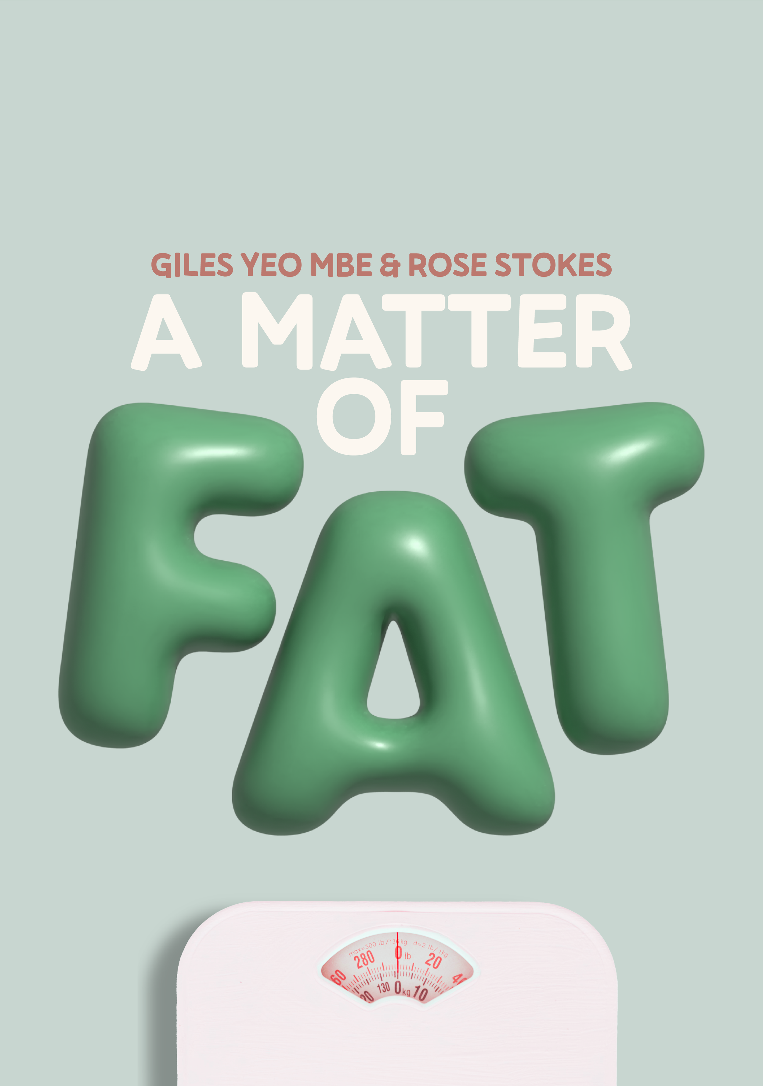
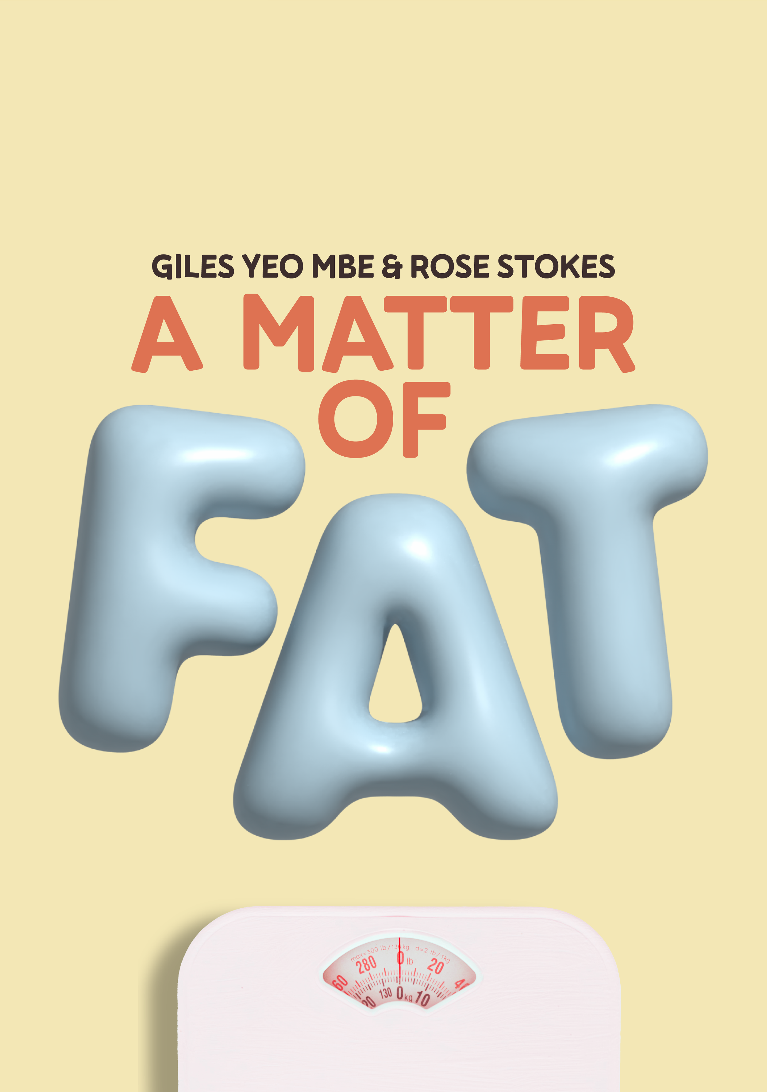
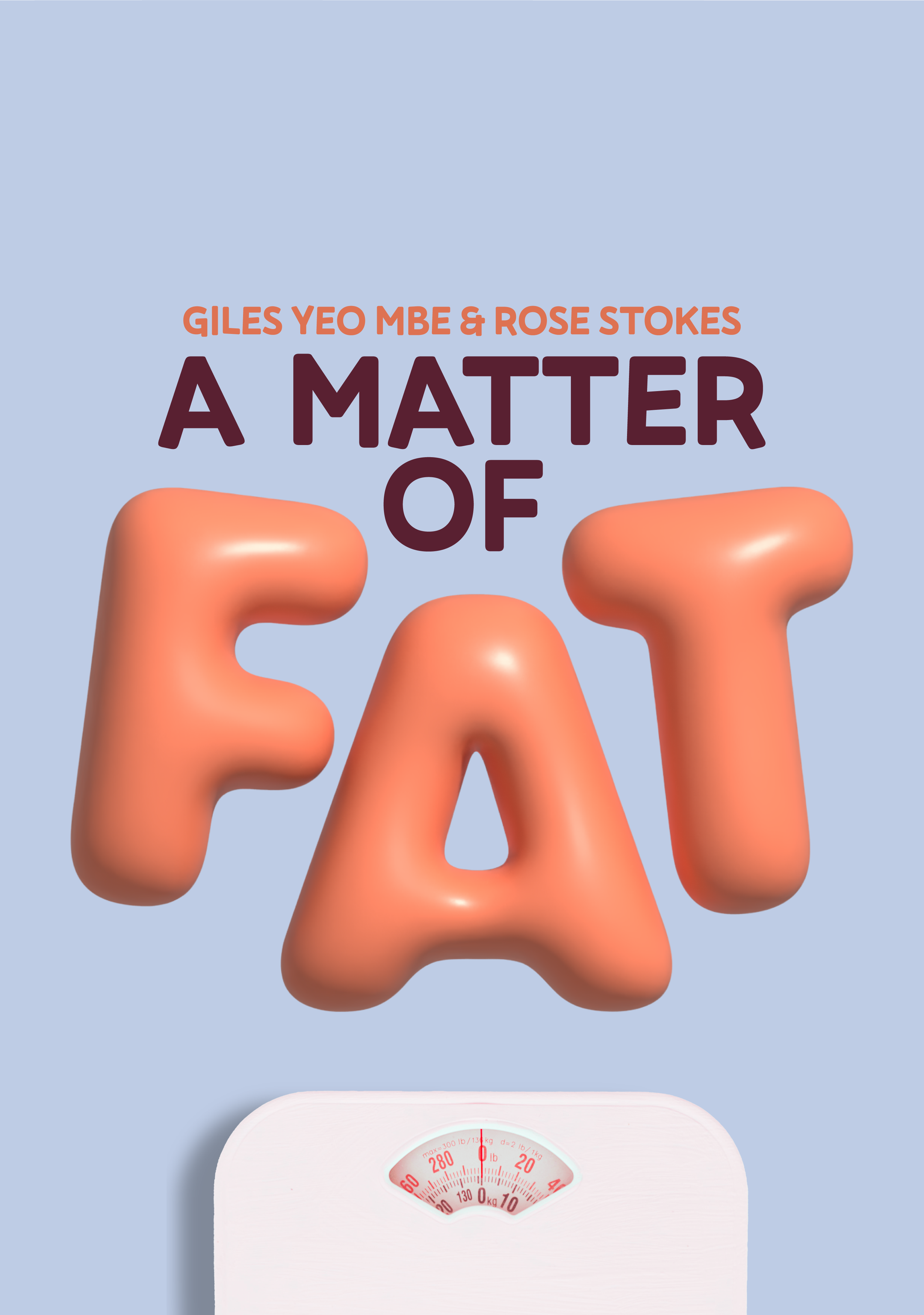
colourway system
DELIVERABLES
A Matter of Fat is a podcast hosted by journalist Rose Stokes and Professor Giles Yeo MBE, a Cambridge obesity scientist.
Each episode takes a different part of the conversation about weight, bodies and the GLP-1 era. The show combines Rose’s lived experience with Giles’s science.
BRAND POSITIONING
A podcast cover is seen at thumbnail size, often for a second or less. The identity had to make the show feel entertaining and interesting while still signalling that it is factual and science-backed, with the topic clear at a glance.
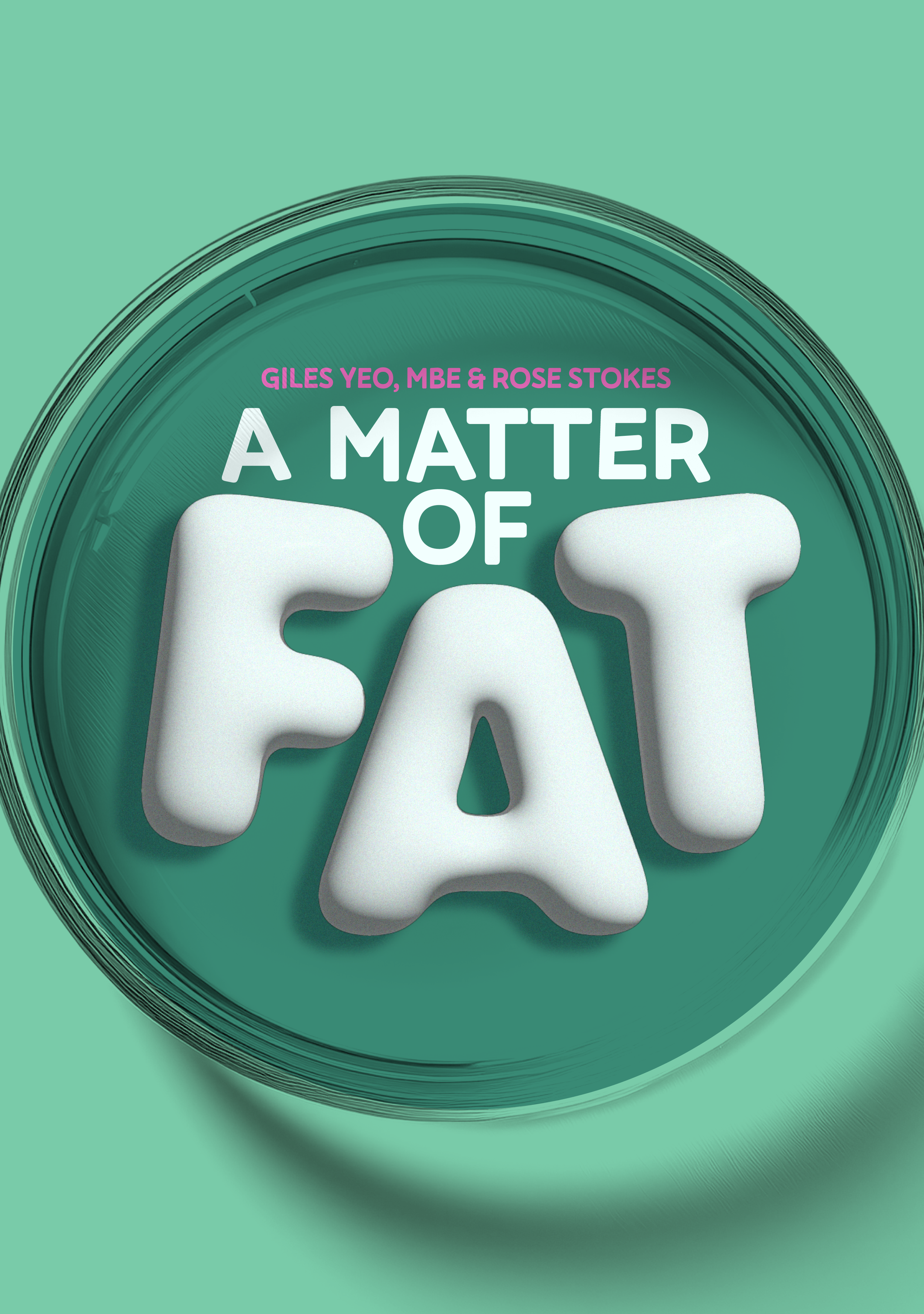
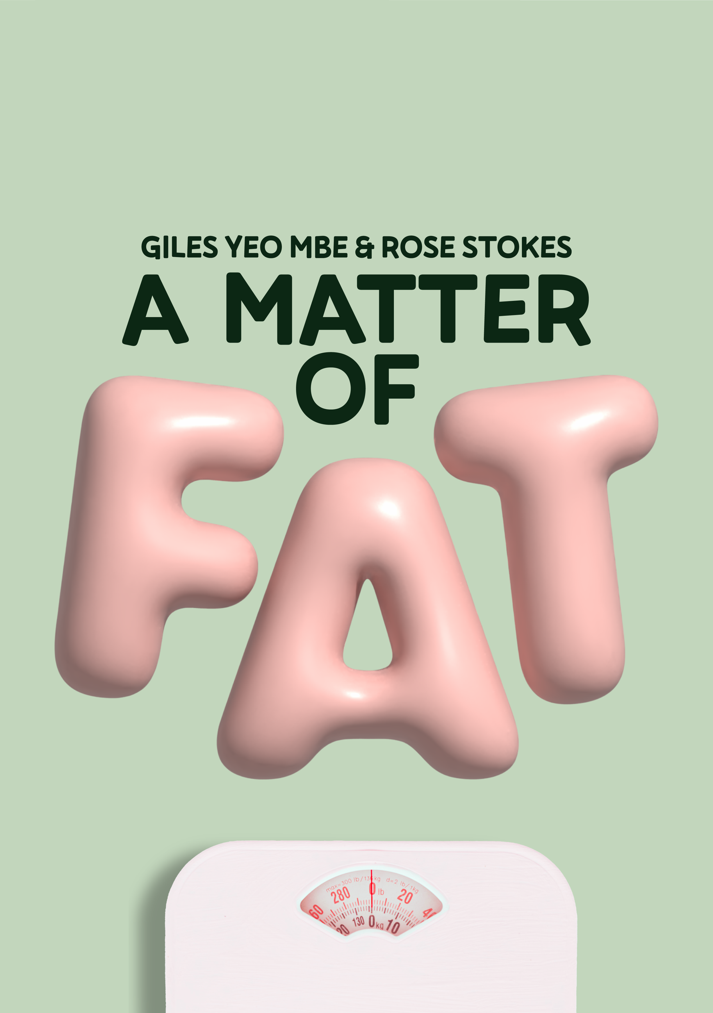
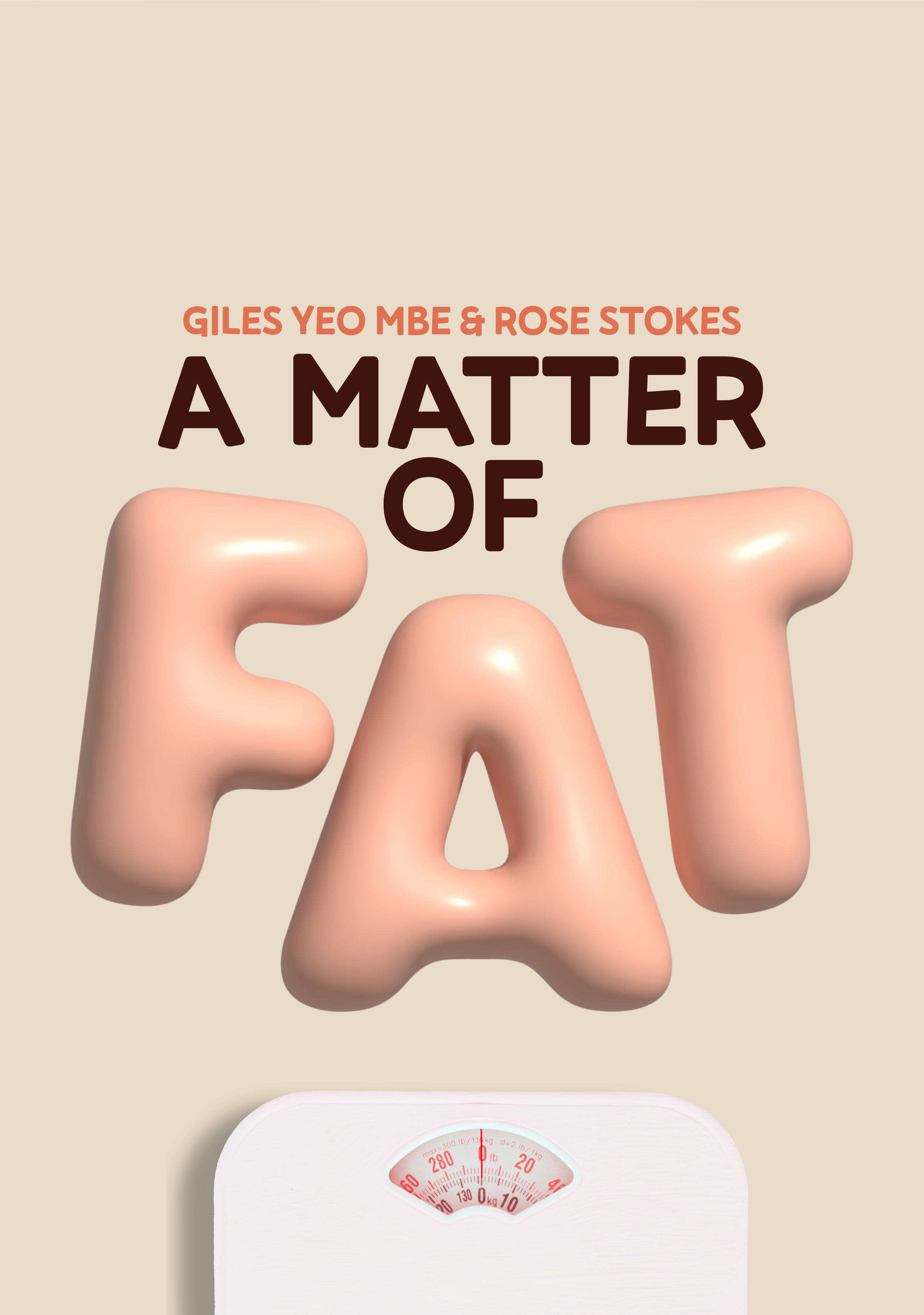
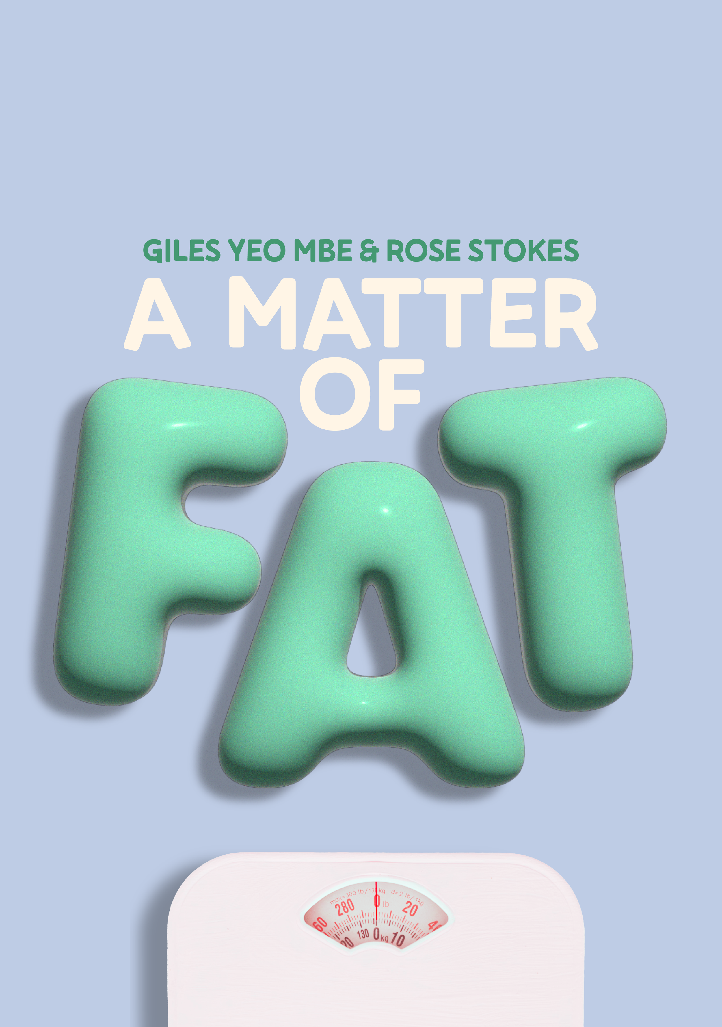
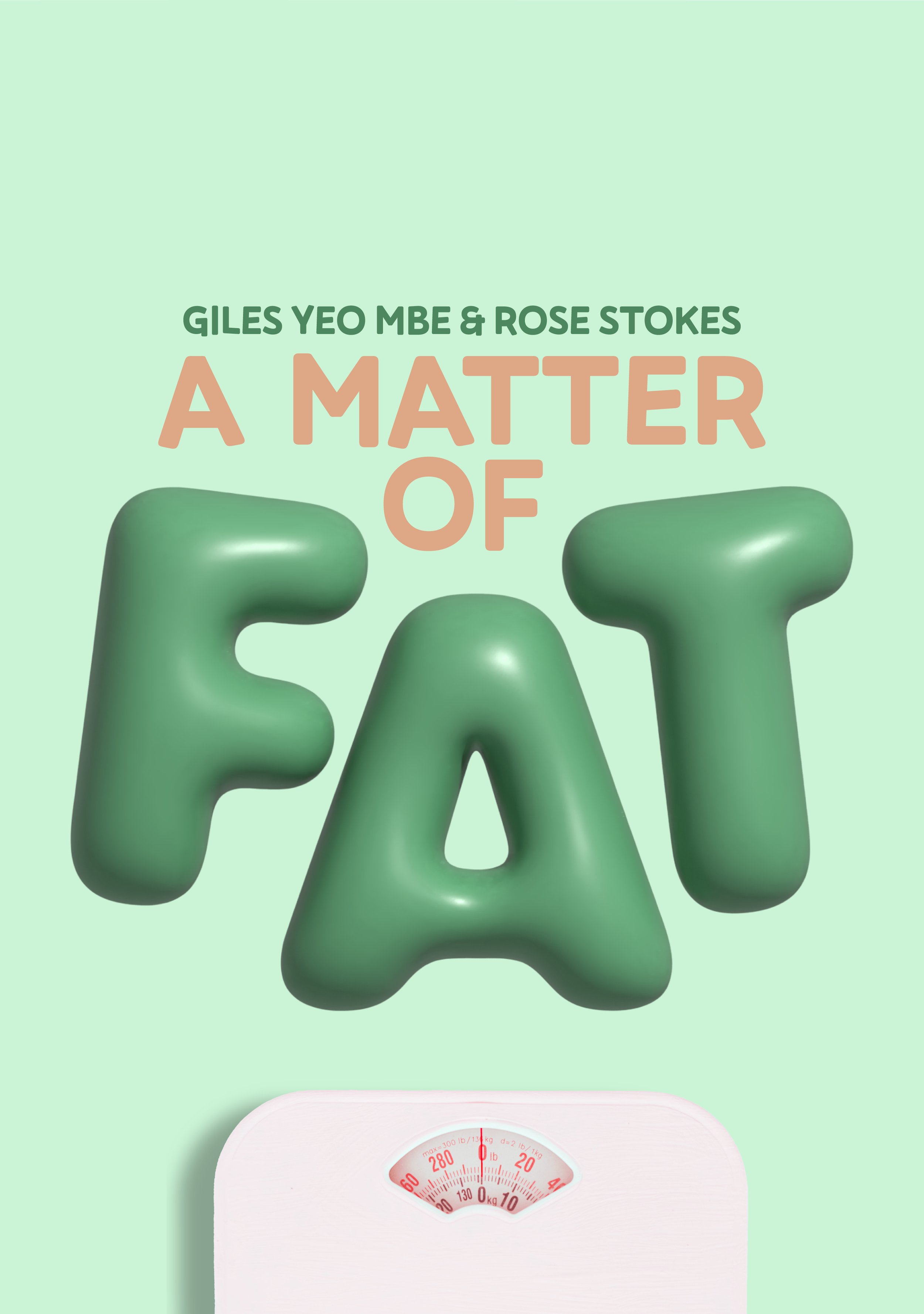
Sister Studio designed bold, inflated letters that make the subject clear before anyone hits play, and carried the same look across Apple Podcasts, YouTube and social.
THE CHALLENGE

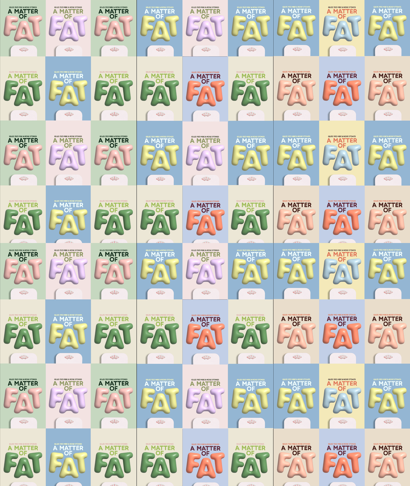
Logo colours
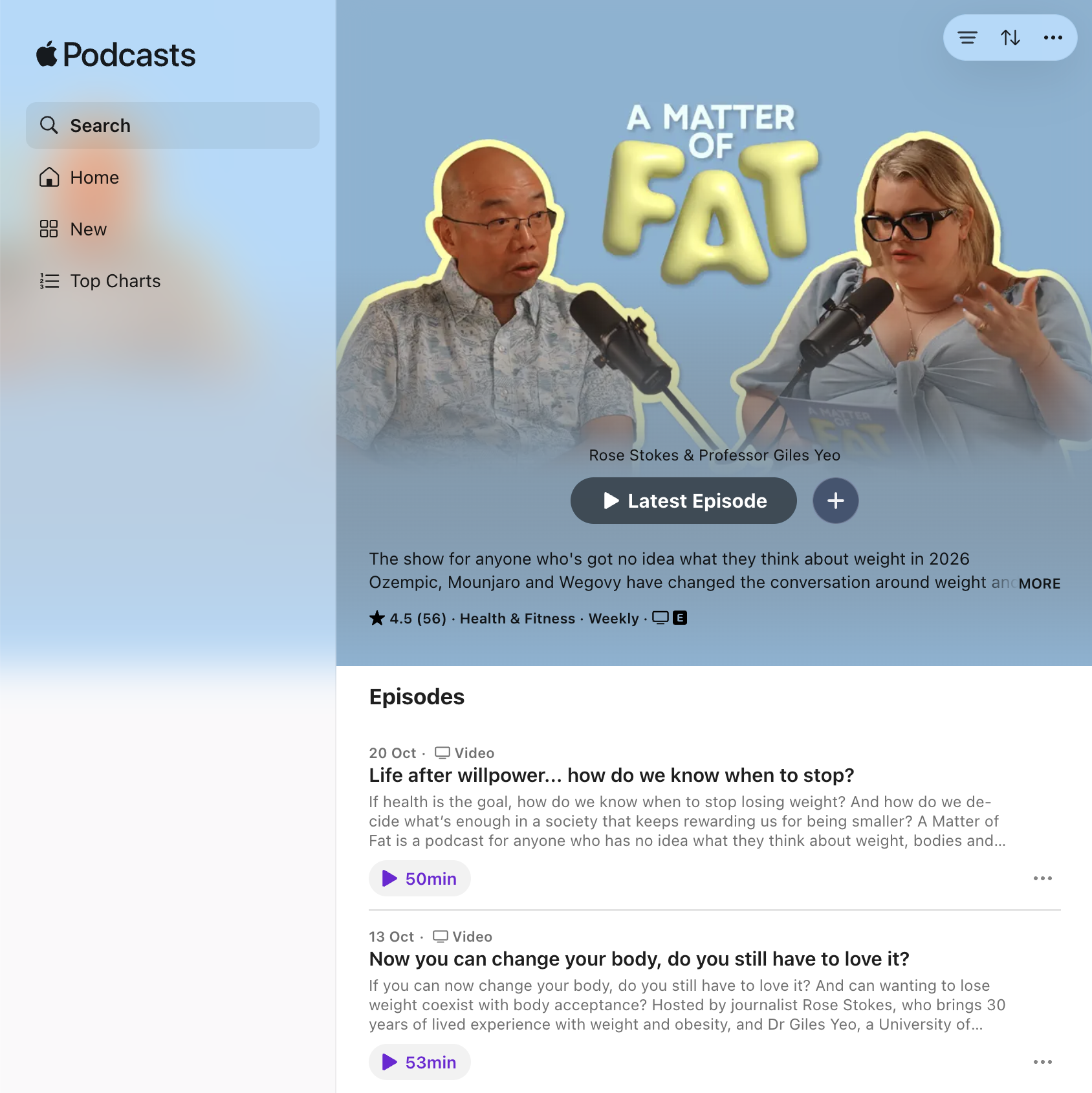

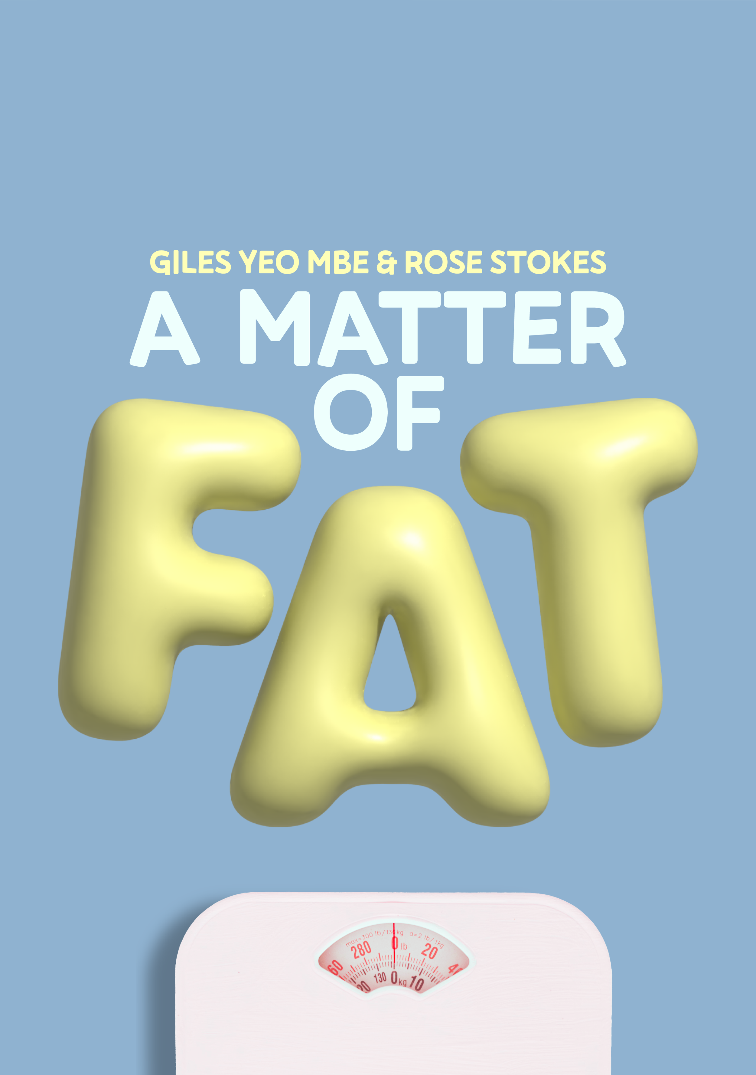
Sister Studio designed bold, inflated letters that make the show’s topic clear before anyone hits play. The lettering is playful enough to draw the eye, while the clean composition and restrained palette signal that the show is factual and science-backed. The same look carries across Apple Podcasts, YouTube and social, so the show feels entertaining and credible wherever listeners meet it.
THE SOLUTION
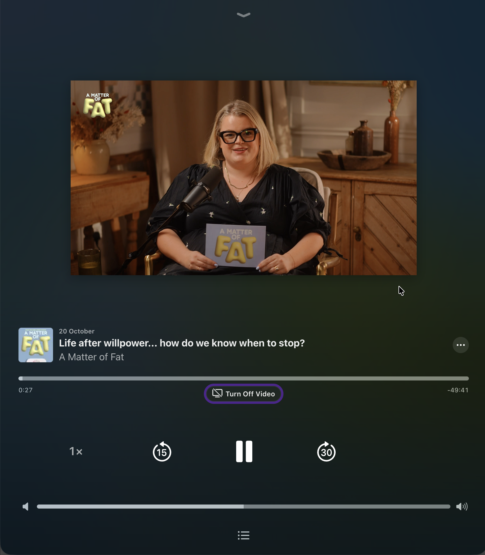
Instagram Videos
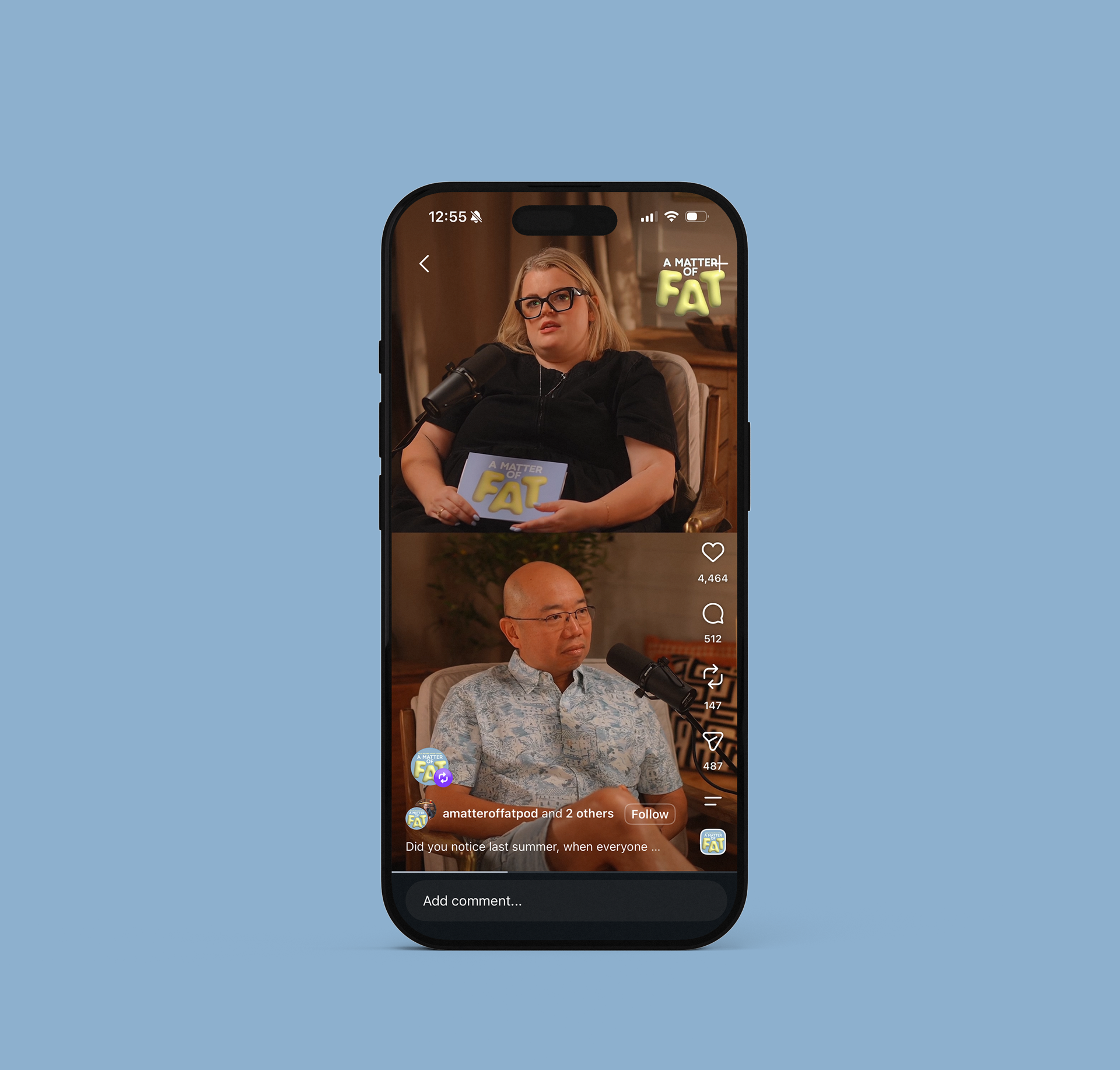
Apple Icons
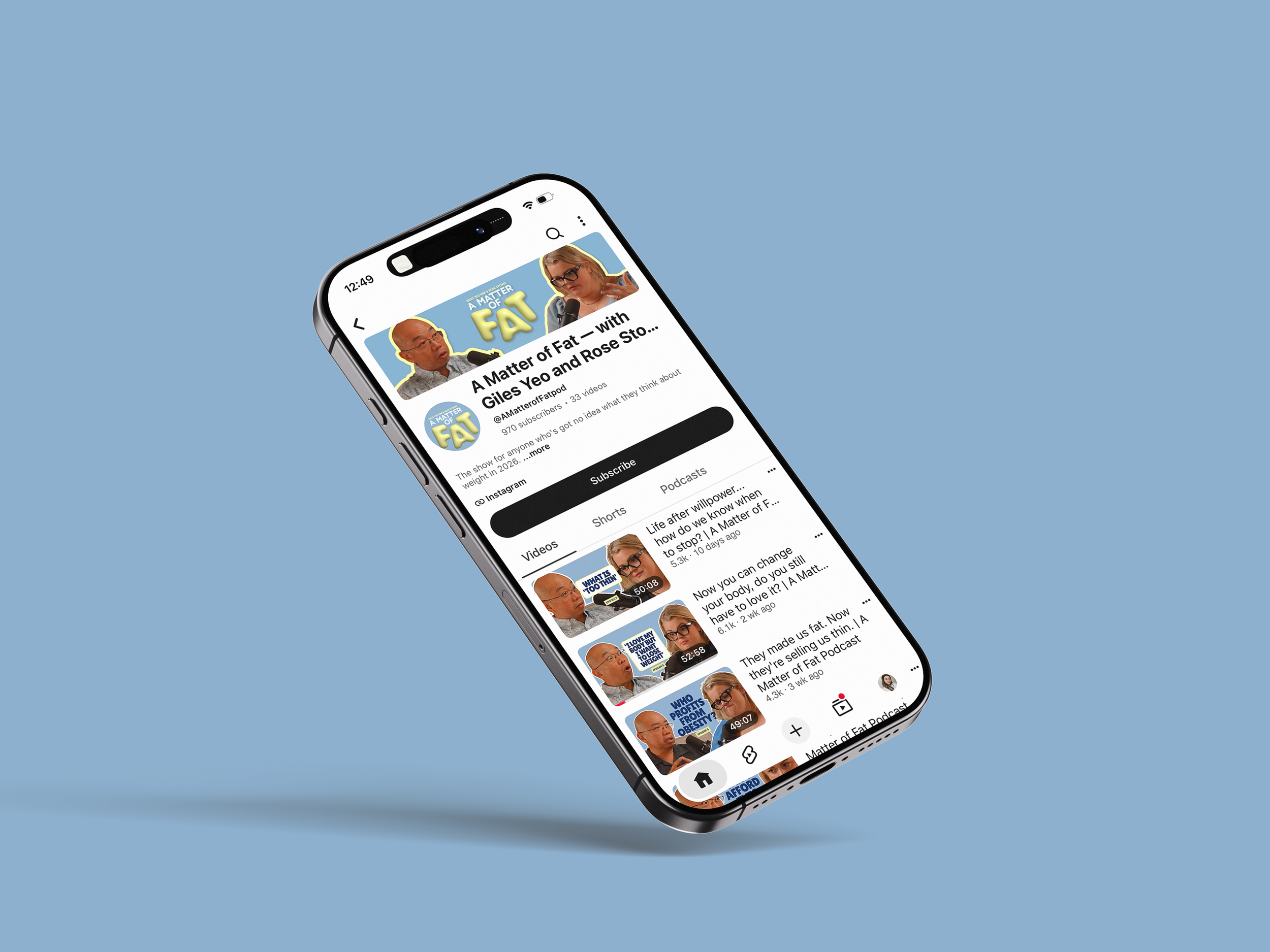
Youtube
“FAT” fills the frame in inflated letters, and the bathroom scale below it makes the subject unmistakable. A listener scrolling past knows the topic instantly.
Inflated lettering is the most direct expression of the direction. It’s tactile in a way flat type can’t be, almost toy-like in its softness, and its scale and saturated colour make it graphical enough to hold a feed.
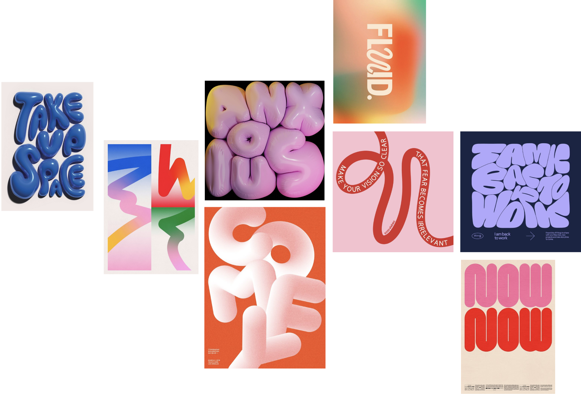
MOODBOARD
INITIAL CONCEPTS THAT DIDN’T QUITE MAKE THE CUT
PROCESS
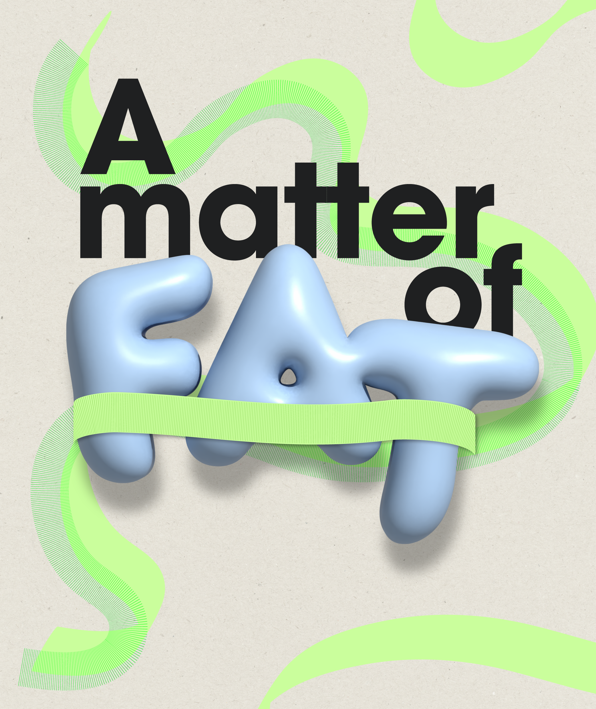
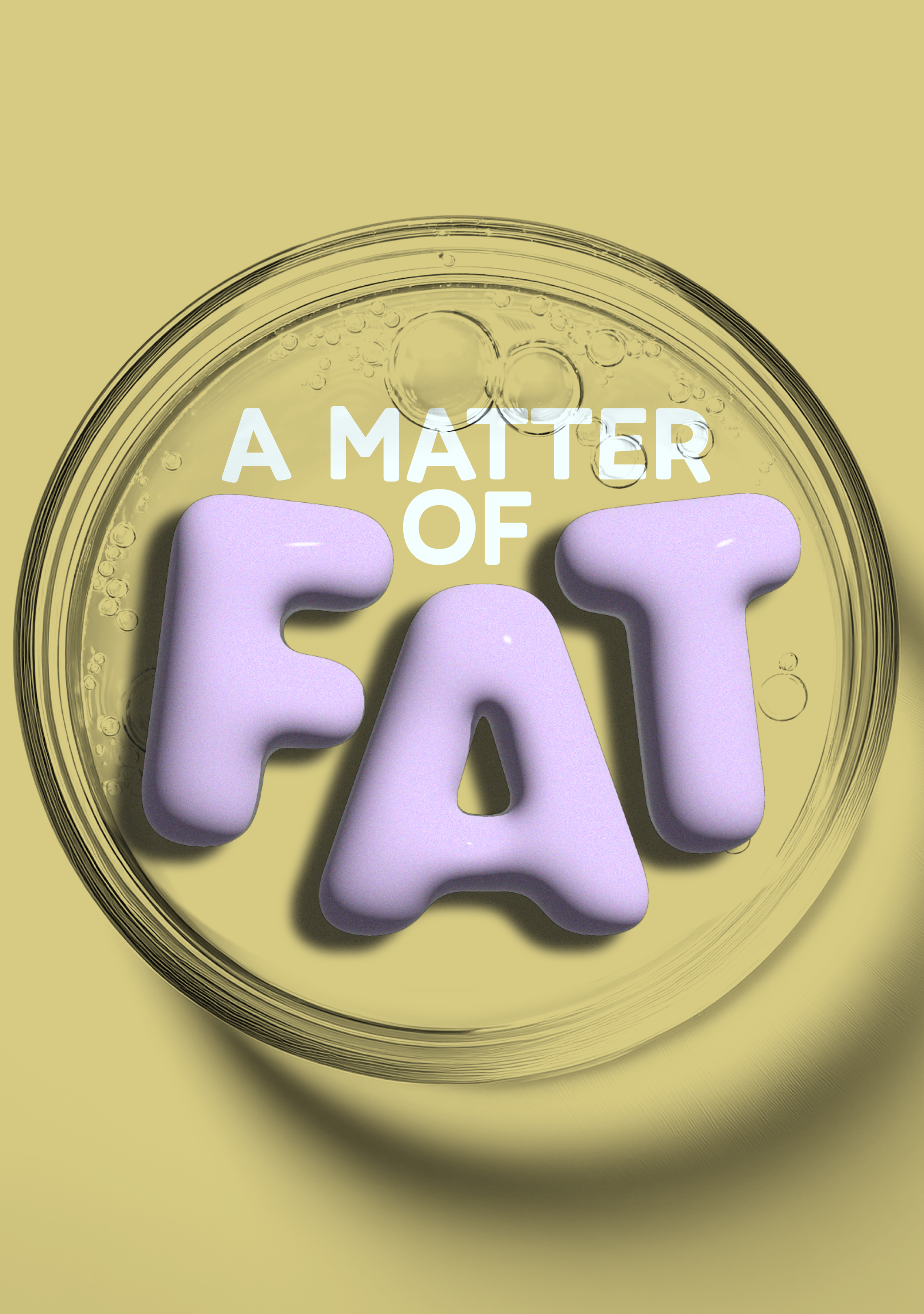
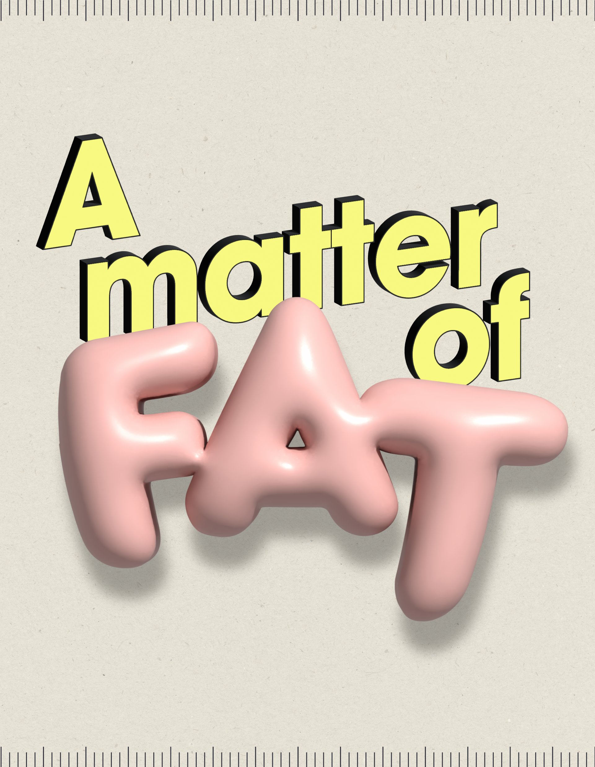
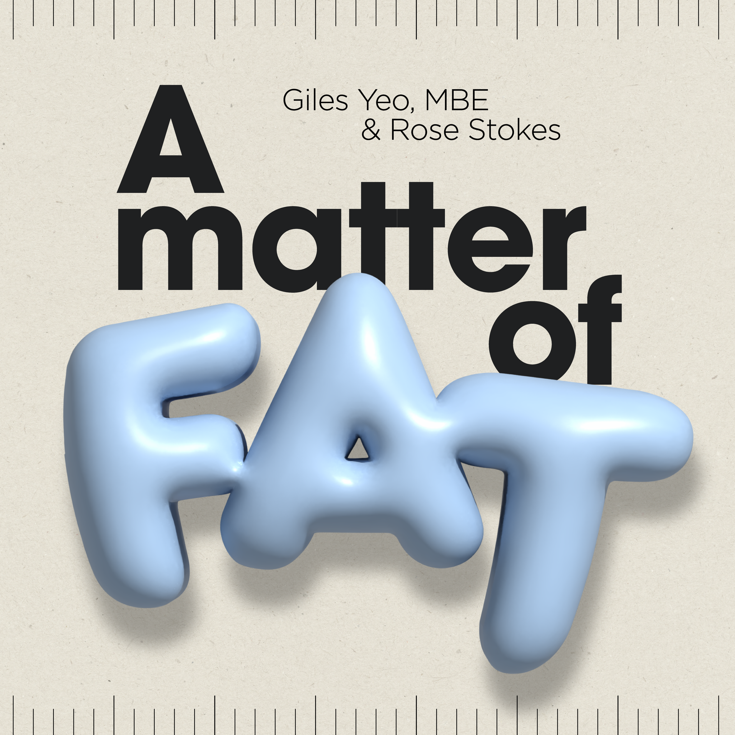
The early rounds tested how far the inflated “FAT” could be pushed, with different palettes, backgrounds and props. Textured paper, a tape measure and a glass dish each added something, but the final design needed less.
“Lissy immediately understood the brand’s aesthetic and translated it into beautiful, high-performing graphics that felt both on-brand and fresh.
She struck the perfect balance between the simplicity of the brand and playful, scroll stopping design.
TESTIMONIAL
The whole process was smooth, collaborative and efficient, and the final creatives really elevated the campaign.
I’d happily recommend Lissy to anyone looking for impactful, thoughtful digital design. She just gets it!”
— ROSE STOKES, PODCASTER + JOURNALIST
lets create your
next campaign
Other projects
brambles glass
identity design
sleepydoe pyjamas
social ad campaign
hue + holasz
identity design, content creation and website